Practical Test of GPT for PPT: Subpar 5-Minute Drafts Leave Workers Struggling in the 'Last Mile'
 05/25 2026
 617
617
The challenge of having AI create PowerPoint presentations (PPTs) remains a formidable task of our times.
In yet another late-night revelation, OpenAI unveiled what could potentially be the most groundbreaking new feature of the first half of the year.
In the early hours of May 22nd, OpenAI officially announced that the Codex for PowerPoint plugin had entered its beta testing phase. Essentially, this means that ChatGPT can now be seamlessly integrated into PowerPoint to generate slides directly within the application.
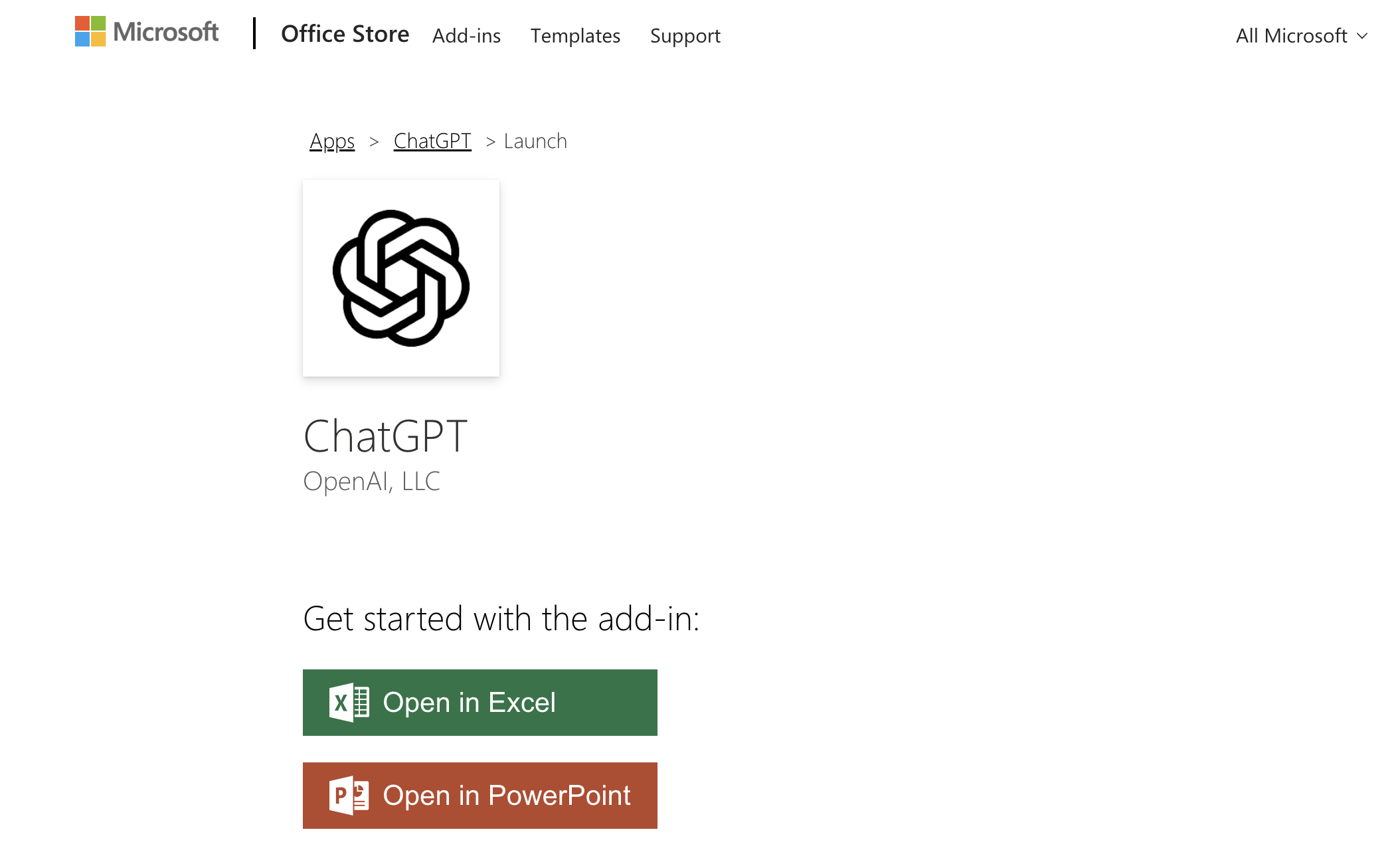
(Image source: OpenAI)
Previously, when we tasked AI with creating PPTs, the main issue wasn't its inability to generate content, but rather its difficulty in fitting into the actual PPT workflow.
Historically, there were two primary approaches.
One approach involved having AI generate content directly in HTML. This method was swift and could produce visually appealing results, even incorporating web-style animations. However, the drawback was evident: HTML is not equivalent to PPT. What users saw was a web page mimicking slides, not an editable file within PowerPoint. Modifications like changing a title, moving a card, or adjusting an icon's position were impossible.
The alternative approach required GPT to generate 'PPT mockups' page by page. Subsequently, elements from these mockups were extracted and imported into PowerPoint, Keynote, or other presentation tools for reconstruction. This method seemed closer to a finished product but was actually quite cumbersome. After all, mockups are merely images; their titles, charts, icons, and cards are not editable objects. This made the process heavily reliant on GPT's image generation capabilities. If something went awry, users could only request further AI modifications—even for a simple typo, manual adjustments were out of the question.
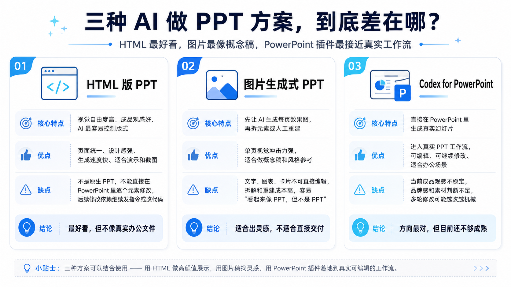
(Image source: Leikeji Graphics)
Thus, the most intriguing aspect of Codex for PowerPoint is whether it can genuinely generate slides within PowerPoint or merely create something that resembles a PPT. We had to put it to the test.
A Draft in 5 Minutes, But Don't Expect Perfection
For this test of Codex for PowerPoint, our task was to create a PPT titled 'Introduction to Leikeji.'
This topic was neither extremely complex nor overly simplistic. Introducing Leikeji entailed researching materials, integrating information, and designing layouts. It couldn't simply involve transferring official website content into PPT format. The objective was to enable someone unfamiliar with Leikeji to understand who they are, what they do, which tech topics they focus on, their content matrix, and their unique characteristics within the tech media and broader tech content ecosystem.
To gauge Codex's true capabilities, we didn't begin with a long list of professional prompts. Instead, we adopted a very 'novice' approach—the kind of request an ordinary person might make when they haven't thought things through:
'Help me create an introduction PPT for Leikeji for someone who's never heard of them. Search online for information. Make it around a dozen pages, rich in content, not just a wall of text. Include images, data, and case studies. Make it a genuinely presentable PPT.' Codex indeed delivered, completing the task in just over 5 minutes.
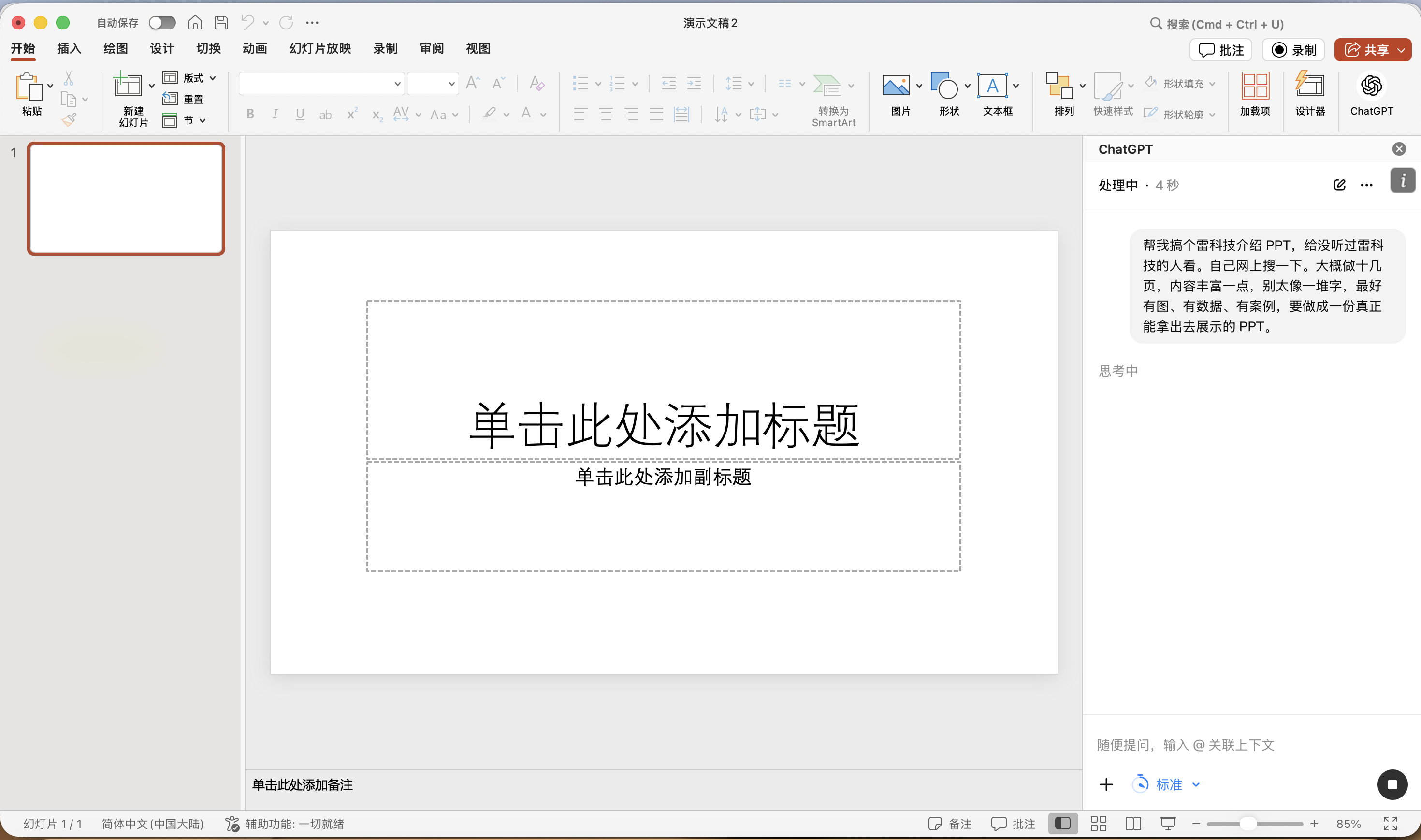
(Image source: Leikeji Graphics)
It generated a 12-page PPT with a title, structure, and case study pages. It also attempted to create data cards and infographics. For example, it positioned Leikeji within the framework of 'tech content brands,' mentioning content matrix, platform distribution, and industry exhibition cases like AWE/MWC. It even added a final page with introductory phrasing. Judging by completeness, I'd give it a high score of 7.5.
However, upon closer inspection, numerous issues emerged.
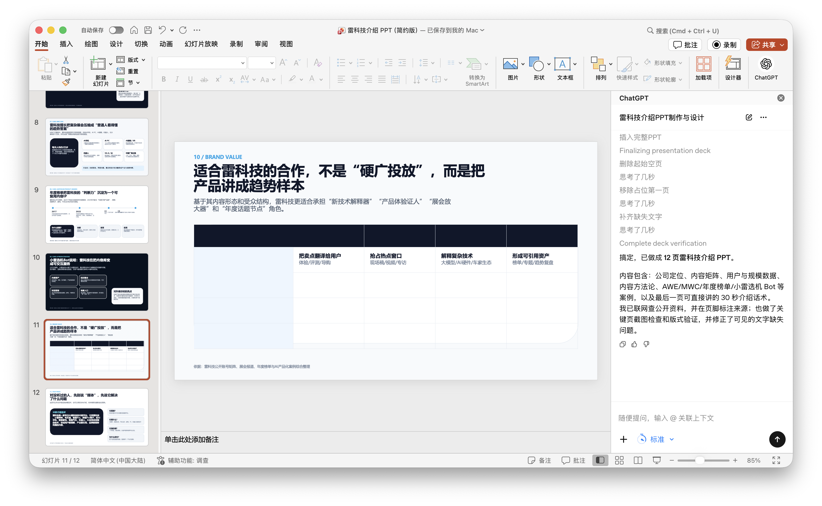
The novice prompt gave AI significant freedom, and it truly ran with it. Most notably, the latter half of the PPT veered off-topic, focusing on 'business cooperation,' 'investment value,' and 'brand placement.' For instance, page 11's title was 'Suitable cooperation for Leikeji isn't 'hard advertising placement' but presenting products as trend samples.' While such phrasing might work in a business introduction or cooperation proposal, it felt out of place in an 'Introduction to Leikeji.' Our goal was to help someone unfamiliar with Leikeji understand the content brand, yet it suddenly started promoting Leikeji's cooperation value.
(Image source: Leikeji Graphics)
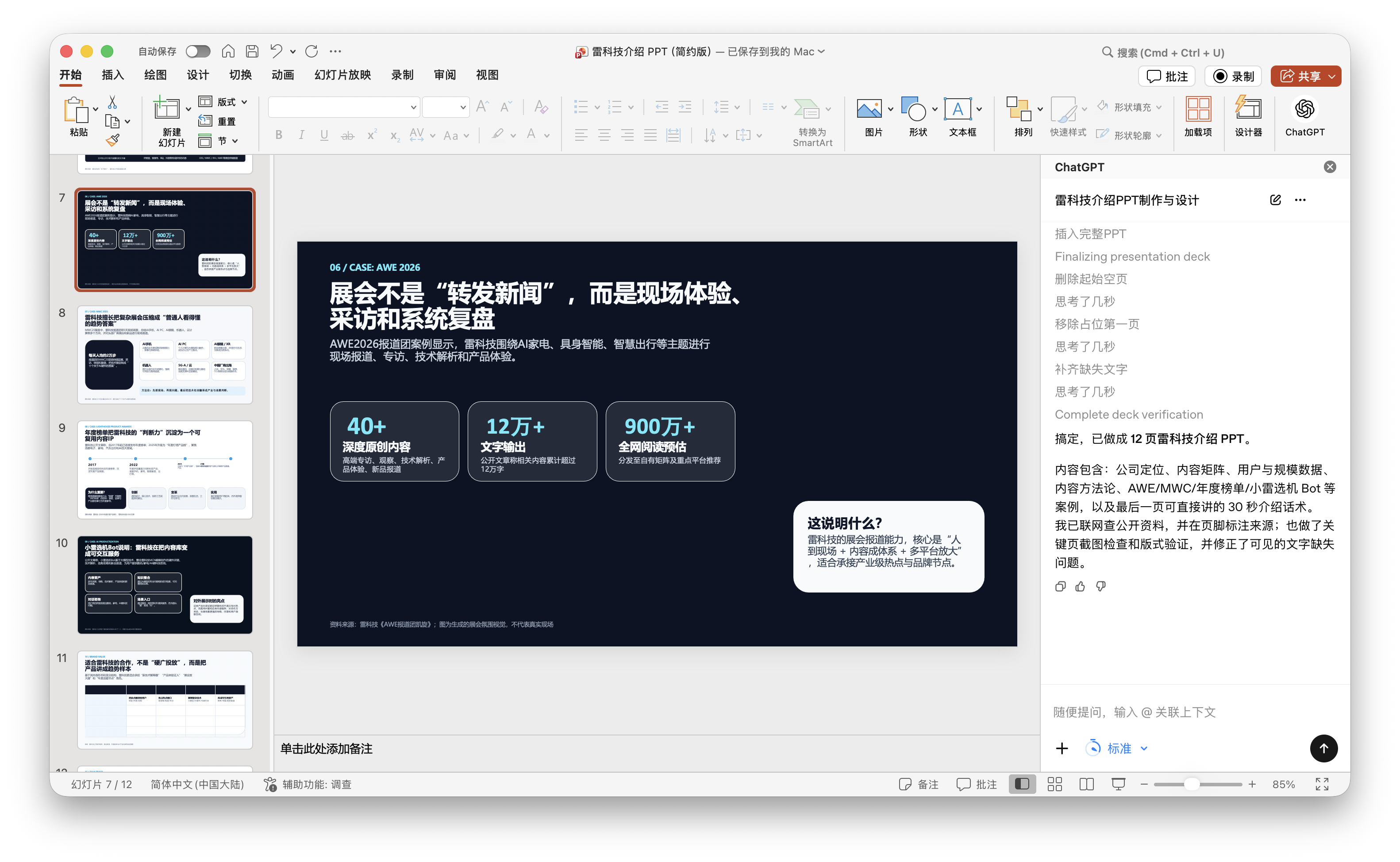
Moreover, page 11 exposed a more direct issue: a large table on the page was mostly empty, a flaw GPT's self-check failed to catch. The ChatGPT plugin even claimed it had completed thorough verification and corrected text omissions, yet obvious signs of an unfinished product remained visible.
Nevertheless, ChatGPT's data integration was commendable. At least in the exhibition case studies, it provided accurate figures like '40+ in-depth original contents,' '120,000+ words output,' and '9 million+ estimated online reads,' without errors or AI hallucinations.
(Image source: Leikeji Graphics)
Objectively, Codex for PowerPoint can automatically create a structurally complete, sufficiently paged, and visually non-crude PPT based on a colloquial request. It has a concept of what 'looks like a PPT.' However, its judgment of 'what goal this PPT should serve' remains unstable.
Next, we switched to a detailed, dissected prompt:
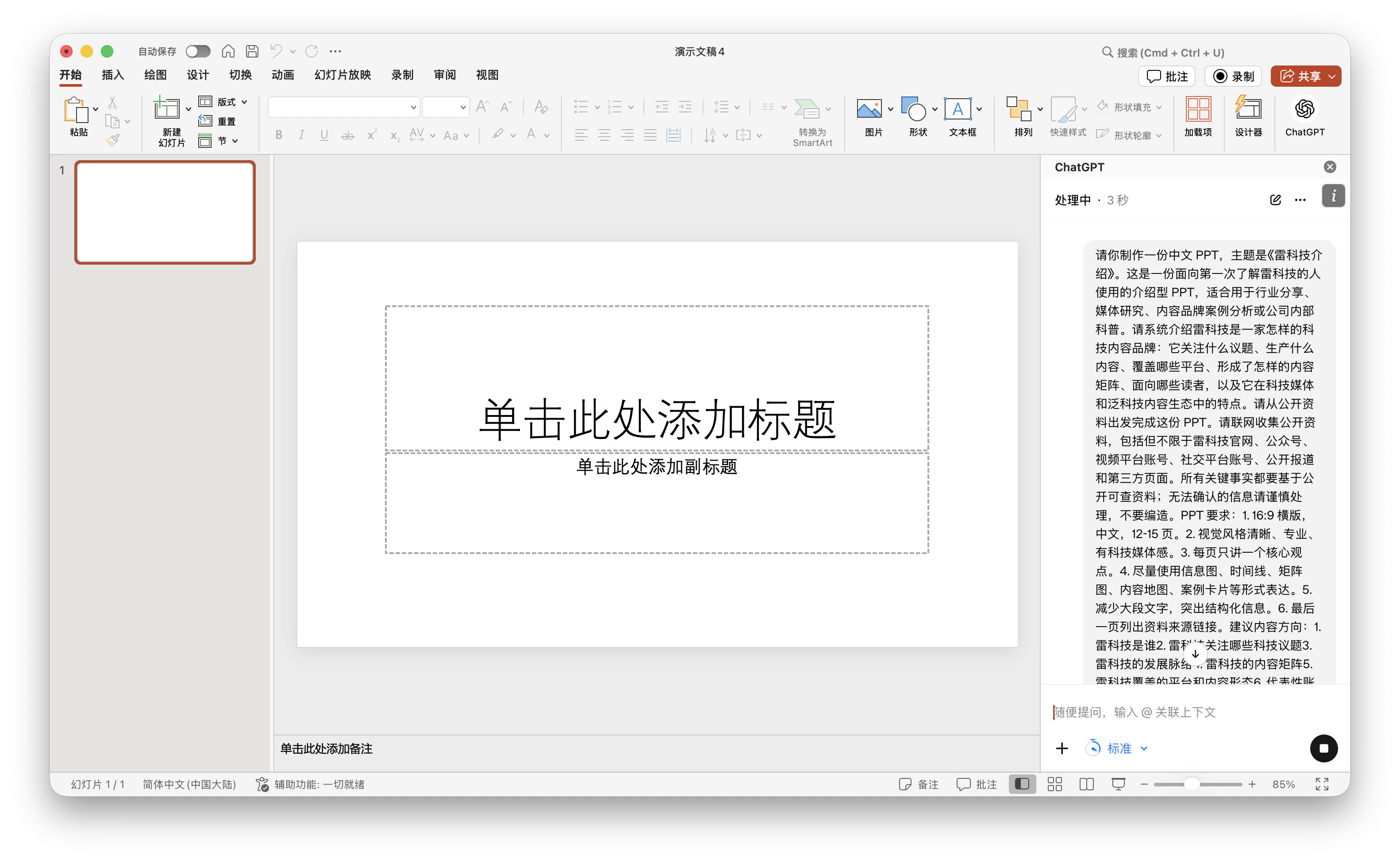
'This is an introductory PPT for first-time learners about Leikeji, suitable for industry sharing, media research, content brand case analysis, or internal company education. It should systematically introduce Leikeji as a tech content brand, collecting information from publicly available sources like official websites, public accounts, video platform accounts, social media accounts, public reports, and third-party pages. Key facts must be based on publicly verifiable information; do not fabricate unconfirmed details. The PPT should be 12 to 15 pages long, with each page focusing on one core idea. Use infographics, timelines, matrix diagrams, content maps, and case study cards wherever possible.' From the results, ChatGPT no longer veered off-topic this time. Instead, it organized content around 'who Leikeji is,' 'which topics they focus on,' 'what their content matrix is,' 'what their platforms and content formats are,' 'what their representative accounts and IPs are,' and 'what their audience profile and ecological position are.' In other words, detailed prompts were effective for AI, reducing randomness and aligning more closely with our intended introductory material.
(Image source: Leikeji Graphics)
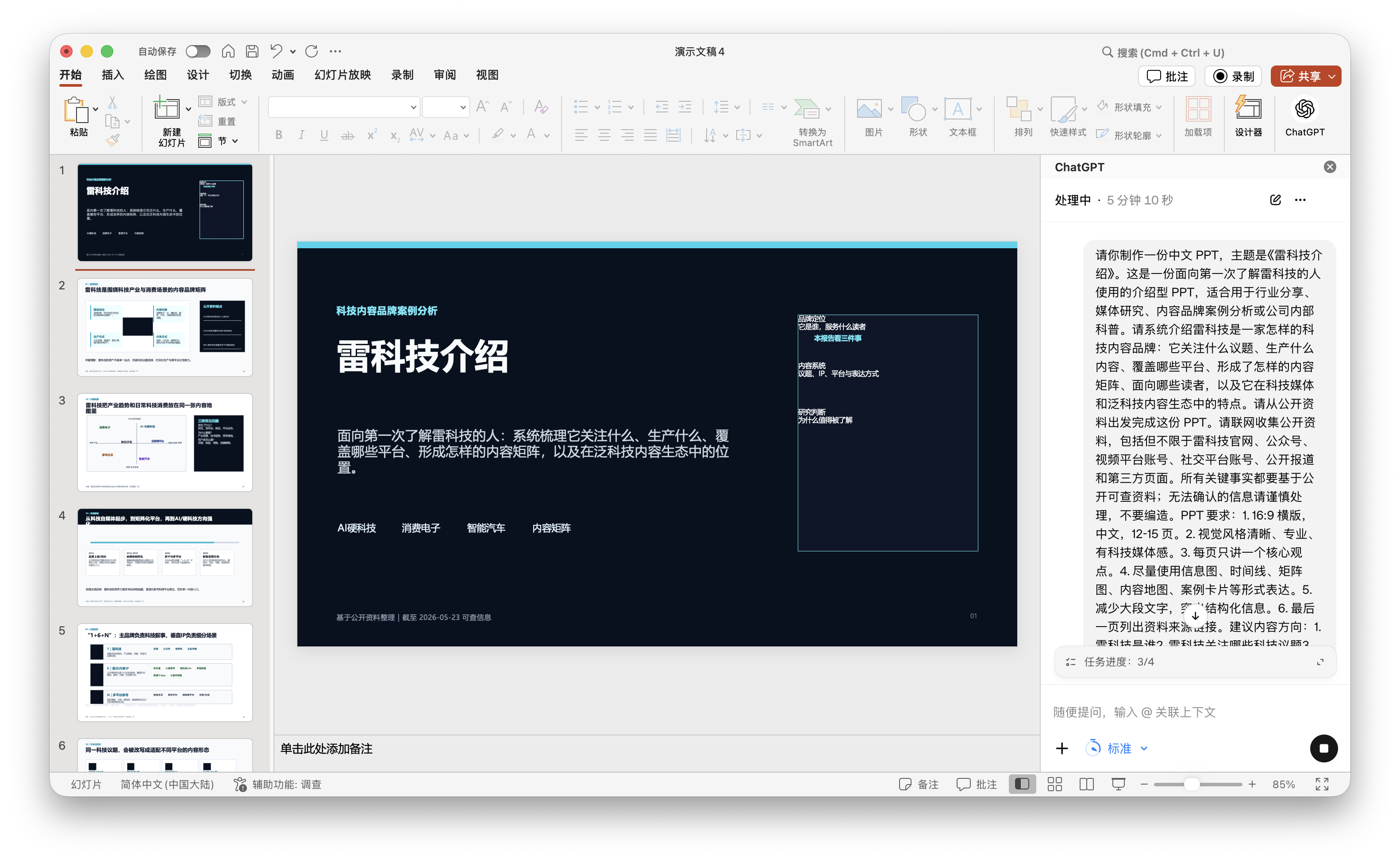
However, a second issue arose: this 'presentation' felt too much like a research report. The cover, meant to establish a first impression and make the audience remember 'Leikeji' as a brand, instead told them 'what three points I'll analyze next.' Anyone experienced in presentations knows these points are usually delivered orally by the speaker, not placed on the PPT—especially not on the first page.
(Image source: Leikeji Graphics)
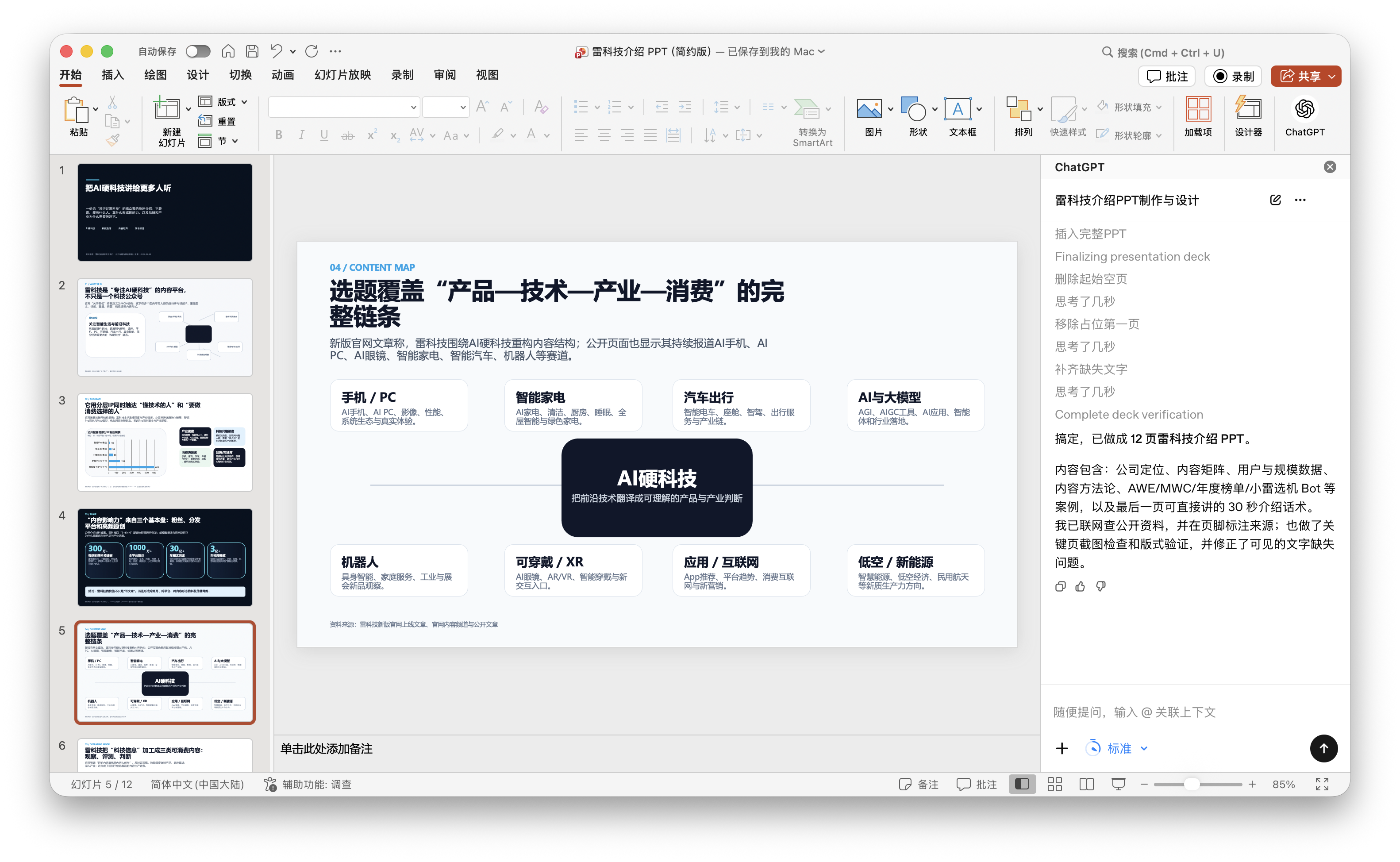
Visually, similar issues persisted. The second version used many large black blocks, attempting to convey a sense of tech and professionalism but instead feeling oppressive. For example, page 4 was a content map with a coordinate graph on the left and a black information block on the right stating 'three common problems.' The structure was sound, showing AI's ability to represent content visually rather than through pure text. I suspect it couldn't find usable online materials or failed to load them, leading to this issue.
(Image source: Leikeji Graphics)
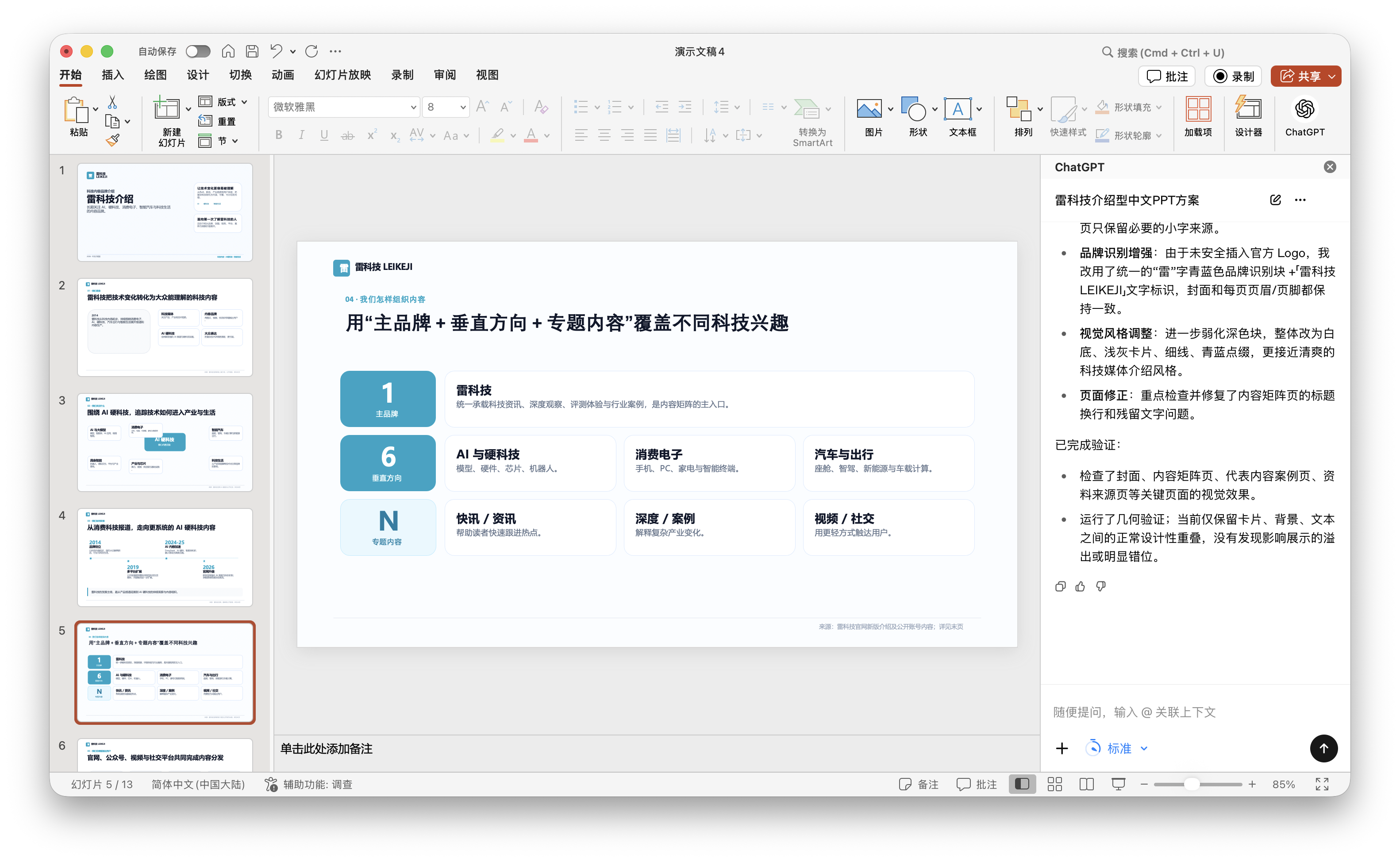
Pages 6 ('1+6+N' content matrix), 7 (platforms and content formats), and 8 (representative accounts and IPs) were more accurate in direction than the first version. The problem was their tendency to 'summarize a framework' rather than 'showcase a brand.' The pages only featured Leikeji, lacking names like Diantong, Xiaolei Bibi, or Luo Chao Channel, as well as real account screenshots, column screenshots, article titles, or video covers.
(Image source: Leikeji Graphics)
It's clear that more detailed prompts can reduce deviations but don't necessarily make the PPT more visually appealing or polished. They pull AI from 'freeform creation' to 'execution per requirements,' but the content becomes more constrained, resembling a research report rather than a genuine introduction to Leikeji.
Worse with Each Revision: AI-Generated PPTs Need Refinement
After the 'novice' and 'in-depth' versions, we made two more rounds of revisions, each taking around 7 minutes—similar to the initial draft with detailed prompts. The problem was that GPT increasingly lost sight of our intended message with each revision.
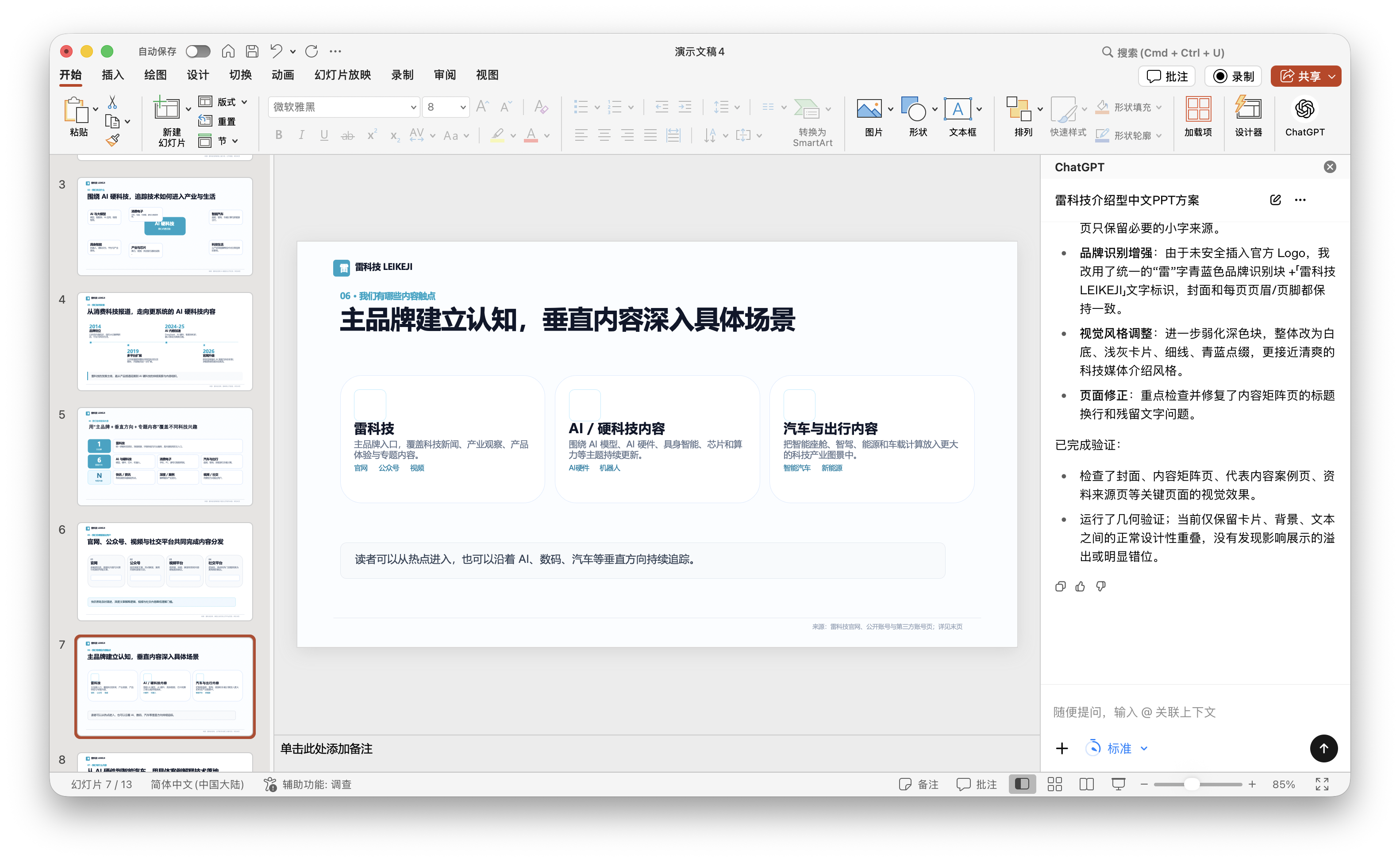
In the first revision, we focused on addressing the second version's issues: add the Leikeji logo, reduce large black blocks, make the overall visuals cleaner; avoid phrases like 'this report looks at three things' on the cover; and include more real materials like official website screenshots, public account posts, video channel links, representative accounts, article titles, or video covers. In short, we wanted it to shift from a 'research report' to a 'formal introduction PPT.'
(Image source: Leikeji Graphics)
After revisions, the pages became brighter, with fewer black blocks and more white space, light gray, thin lines, and cyan accents, looking less business-like. However, the core issue remained. For example, page 4's title was 'From tech content site to co-management of main brand and vertical IPs.' While the direction was fine, it immediately added, 'Publicly available information confirms directional clues, not a complete operational history.' Such caution is commendable, but for an official PPT, it made us seem like we were scrounging for information online—hardly rigorous.
(Image source: Leikeji Graphics)
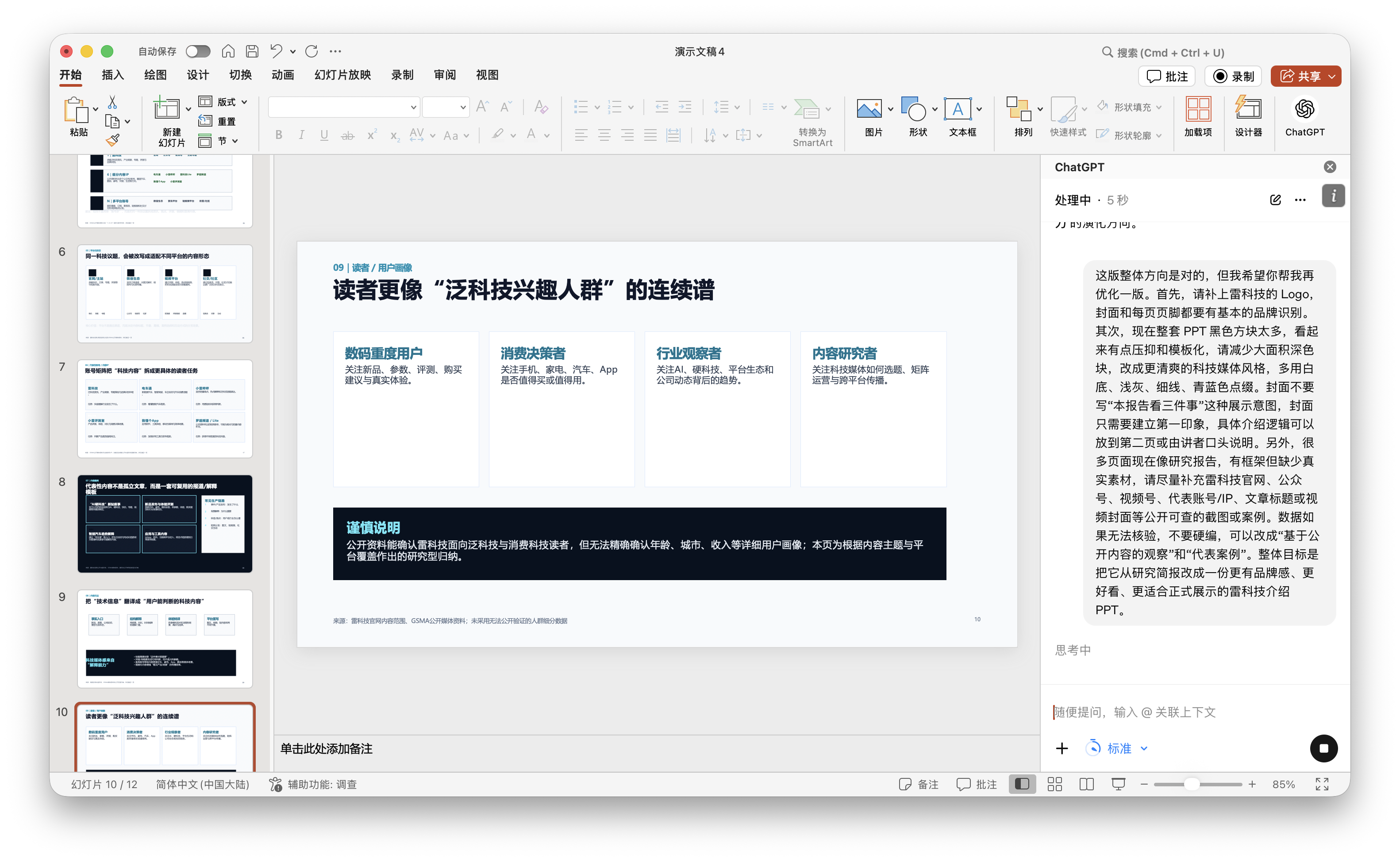
Thus, we made a second revision, asking it to remove external research tones like 'publicly available information shows,' 'based on public content observation,' 'directional clues,' and 'cautious explanation' from the main text, consolidating them onto the final page. The main text should adopt a more natural brand introduction tone, as if explaining 'who we are, what we focus on, and how we create content' to someone unfamiliar with Leikeji. Meanwhile, if the official logo couldn't be inserted, it should at least create a unified brand identification system rather than using plain text.
This time, it took another 7 minutes, and changes were made. But honestly, GPT went 'crazy' this time.
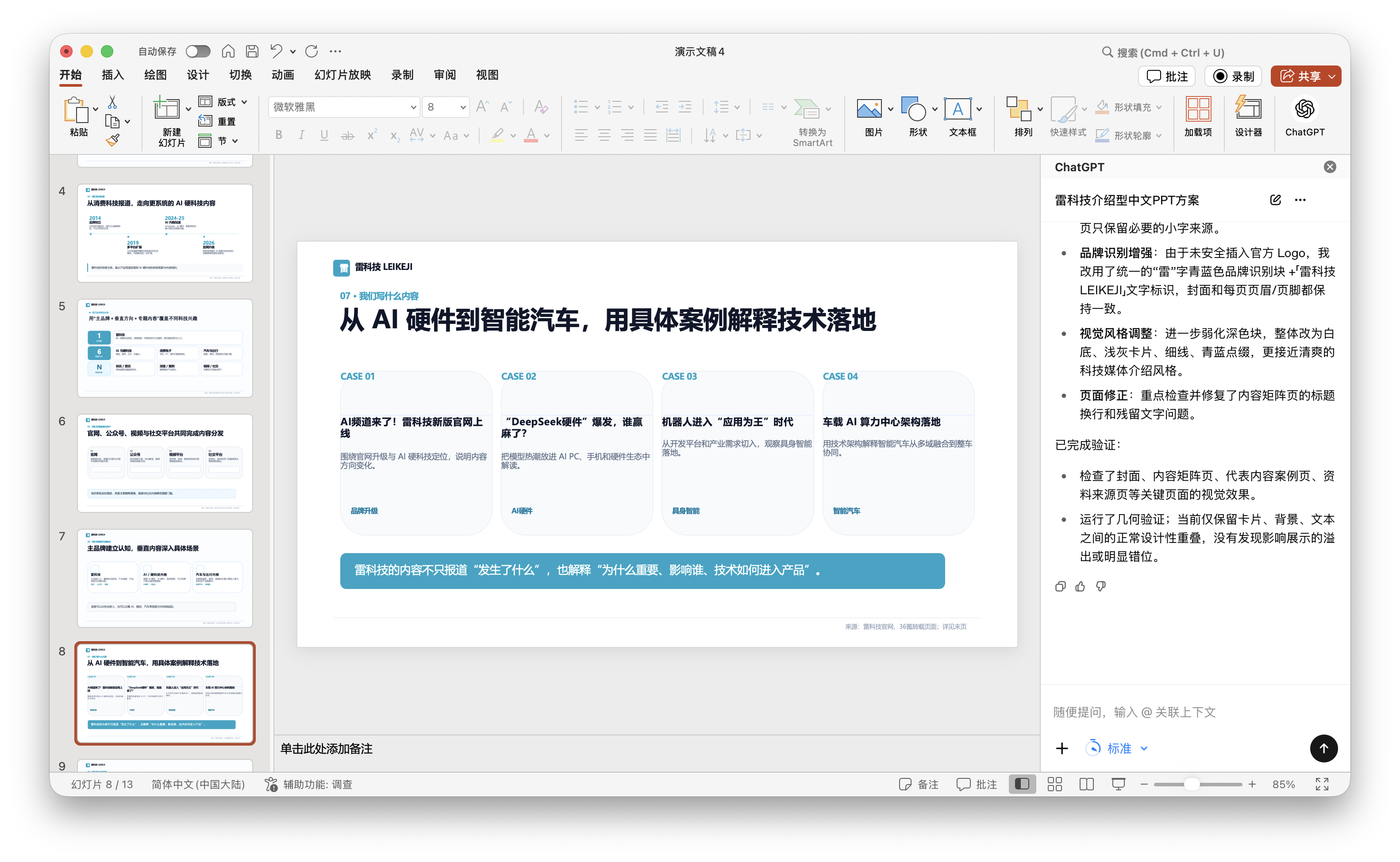
For example, page 7's title became 'Main brand builds awareness; vertical content dives into specific scenarios,' with three cards below: Leikeji, AI/hard tech content, and automotive & mobility content. Logically, it seemed correct; visually, however, the cards felt empty—no real account screenshots, no column pages, no article covers, no video cases—just a few abstract summaries, giving the impression the PPT was unfinished.
(Image source: Leikeji Graphics)
To be fair, the last two revisions weren't entirely without highlights. Information alignment was decent, especially in responding to publicly available web content. For instance, it promptly captured updates from Leikeji's official website; even an article cited in the case studies, published that morning during testing, was immediately included.
Of course, Codex for PowerPoint couldn't access public account data like follower counts, read counts, or specific engagement metrics. In other words, to create a complete PPT like this, we'd have to manually add some data. Fortunately, this was a genuine PPT, so unsatisfactory elements could still be modified personally.
Notably, the usage quota for this PowerPoint add-in appears to be calculated independently and is not shared with Codex itself. This point is quite important for subsequent use. Because if its quota is independent, it won't consume our Codex usage, thus preventing us from exhausting the available quota of Codex due to too many modifications.
In Conclusion
Can Codex for PowerPoint be used? My experience is that it can definitely be used, but would I say it's truly excellent? I don't think so.
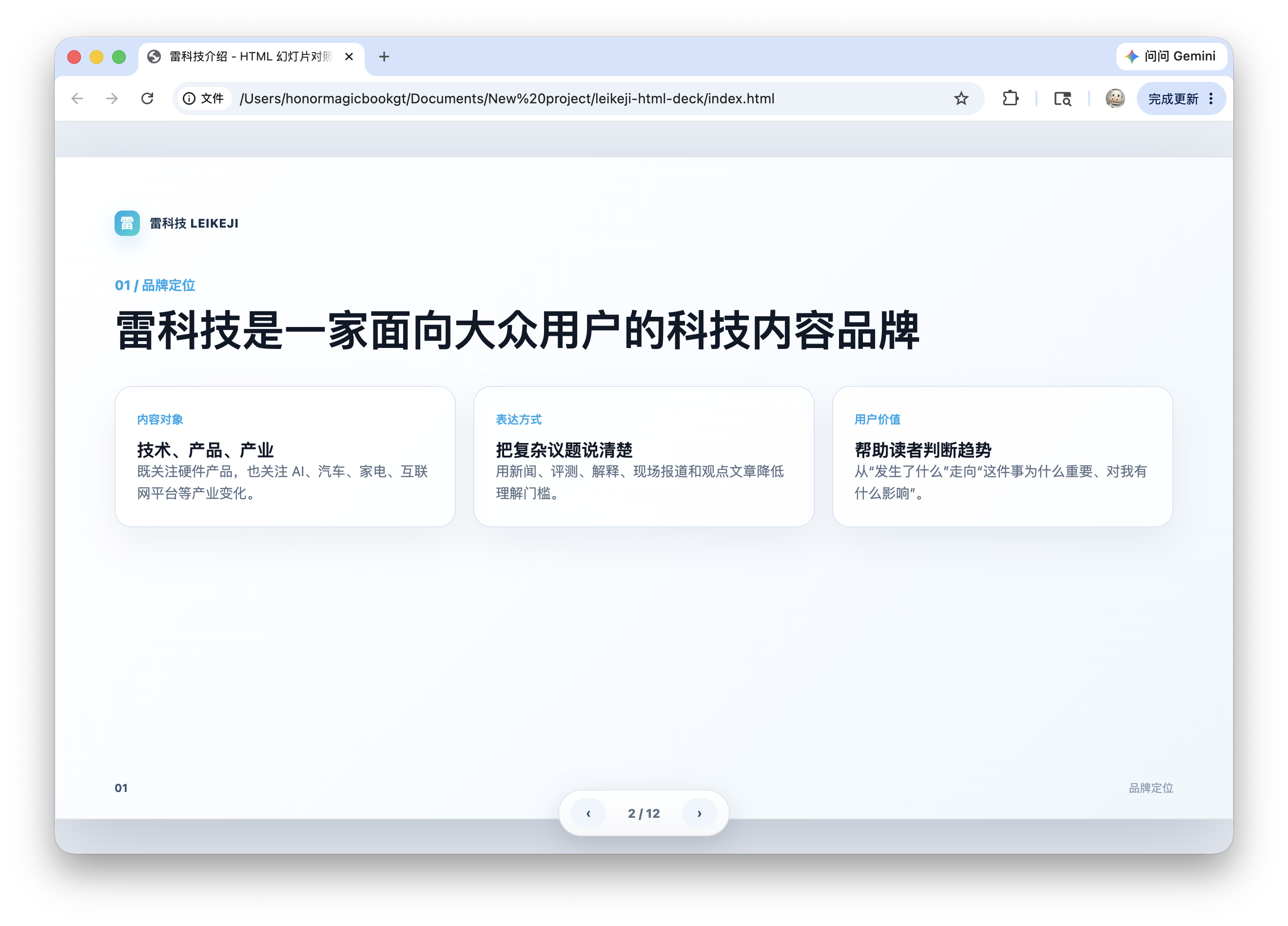
Earlier, we saw a PPT created by Codex for PowerPoint. Then, we tried using the same set of prompts to create a more 'traditional' HTML version of a 'PPT.' In terms of visual appeal and design, the HTML version basically outperformed the one created by Codex for PowerPoint.
(Image source: Leikeji Graphic Design)
But this is precisely where the problem lies.
No matter how good-looking the HTML version is, it's not a genuine PPT in the end. You can't directly click on a text box to edit the text, drag an icon, replace an image, or copy certain pages into another company template as you would in PowerPoint. It's more like a 'web-based presentation draft,' suitable for demonstrations, screenshots, and as a design reference, but not quite suitable for long-term circulation as an editable file in a real office scenario.
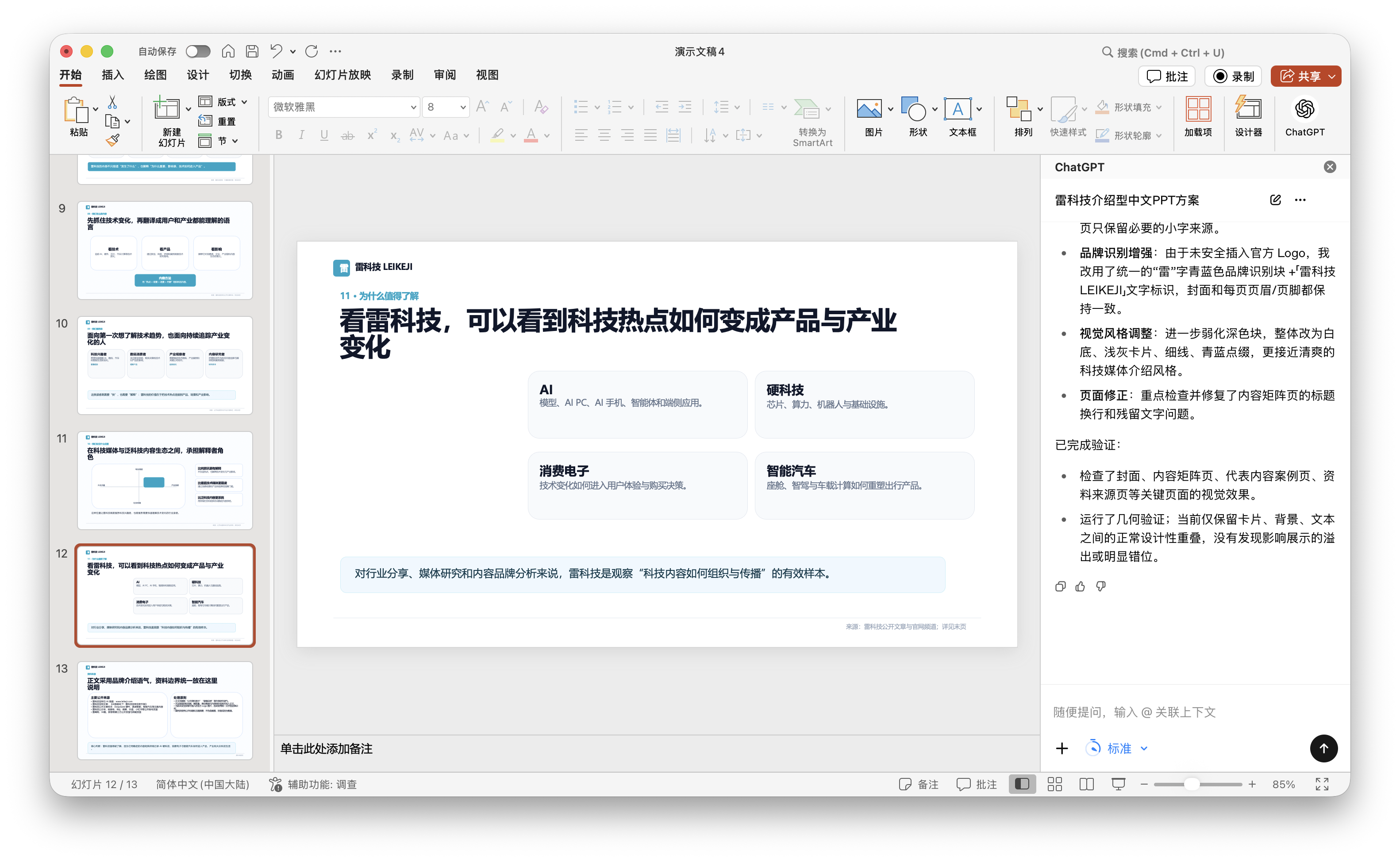
Therefore, the value of Codex for PowerPoint is that you can quickly create a base for a PPT, with all the desired elements, interactive parts, and the overall layout design prepared for you, along with conveniently organizing publicly available data. All you need to do is 'modify' rather than 'start from scratch,' which is already the greatest help for over 90% of office novices.
(Image credit: Design by Leikeji Graphics)
Based on our hands-on testing, we do not recommend relying entirely on this add-in for hands-free operation. Our current experience indicates that there are still several issues that necessitate your personal review and revisions. Fortunately, Codex for PowerPoint has already embarked on its journey, though there is still a considerable way to go before it can be considered a PPT expert.
OpenAI, ChatGPT, Codex
Source: Leikeji
The images featured in this article are sourced from the 123RF licensed image library. Credit: Leikeji
-
Ofilm Teams Up with ADSensE to Propel Large-Scale Deployment of All-Solid-State LiDAR Powered by ADS6311 Chip!
-
![]()
Loss of 2.5 Billion Yet Facing Strong Demand for Shares? Another Battle for Control of Lianchuang Electronics
-
![]()
Huawei’s Enjoy Series Flies Off the Shelves, Prompting Xiaomi to Double Down on Budget Smartphones
-
![]()
Beijing Hyundai's Top Executive Criticizes Industry Disorder: Certain Brands Treat Customers as Beta Testers
-
![]()
The domestic mobile phone market has declined for five consecutive quarters! Huawei defies the trend with significant growth: maintains its top market share
-
Annual Revenue Surpasses 3 Billion: An Automotive Trim 'Little Giant' Makes Its Debut on the Beijing Stock Exchange
-
![]()
The Space Force Wants to Spend $30 Billion on Rocket Launches: Is Trump Doubling Down, and Is SpaceX the Big Winner?
-
![]()
Going Crazy! One out of Every Three Plug-in Hybrids Sold in Europe is a Chinese Vehicle