iOS 18 Preview Experience: Copying Android to the Essence
![]() 06/17 2024
06/17 2024
![]() 745
745
After June 11, Apple began gradually pushing out the first preview version of iOS 18. Those who have read our previous WWDC articles should have a general understanding of some of the new features of iOS 18, such as more flexible desktop settings, more adaptable system functions, and the most anticipated Apple AI.
However, I must first dampen your enthusiasm. The Apple AI, which was explained for forty minutes during WWDC, may not be available until the iPhone 16 series launches. After upgrading to iOS 18, the iPhone 15 Pro currently doesn't differ much from other models.
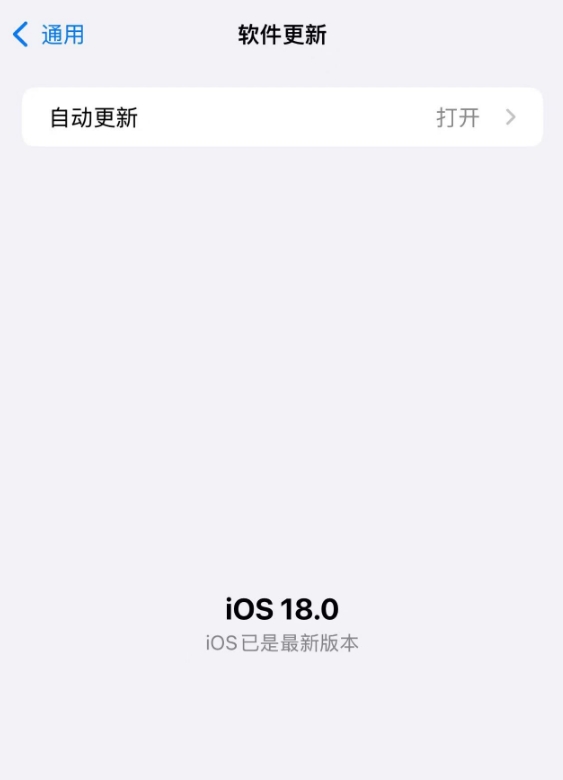
Image Source: Leitech
In addition, some highly anticipated features were not updated in the first preview version, such as the long-awaited call recording function. Currently, Apple has not disclosed which version it will be available in. Considering that this feature directly converts recordings into text and generates a summary, I even suspect it might not be available until ChatGPT completes its integration.
Although iOS 18 is known as the most significant version in recent years, as an Android-iPhone dual-user, I remain calm. After all, these features are familiar to me one after another (doge). Alright, let's get to the point and see how iOS 18 performs in practice.
A Freer iPhone, with a Freer Desktop
Some iPhone designs have always been criticized by users. For example, no matter how you move an app icon, it will automatically reposition itself when you release it. As the once "smartest" system, iOS still cannot achieve the app icon custom placement feature that Android supported a decade ago, which makes one wonder what iOS engineers are doing every day.
However, this regret was finally "eliminated" by Apple in iOS 18. Now, let's welcome iOS 18's "epic" new feature - custom placement of desktop icons. Simply drag the icon to any position, and it will stay there after releasing, instead of "whooshing" back to the end of the icon queue.
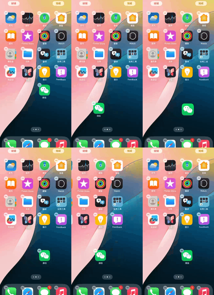
Image Source: Leitech
Isn't this a long-awaited new feature? In addition to custom icon placement, iOS 18 also supports icon darkening, which can be set in the editing page. You can choose whether to keep the icon darkened permanently or activate it with the system's dark mode.
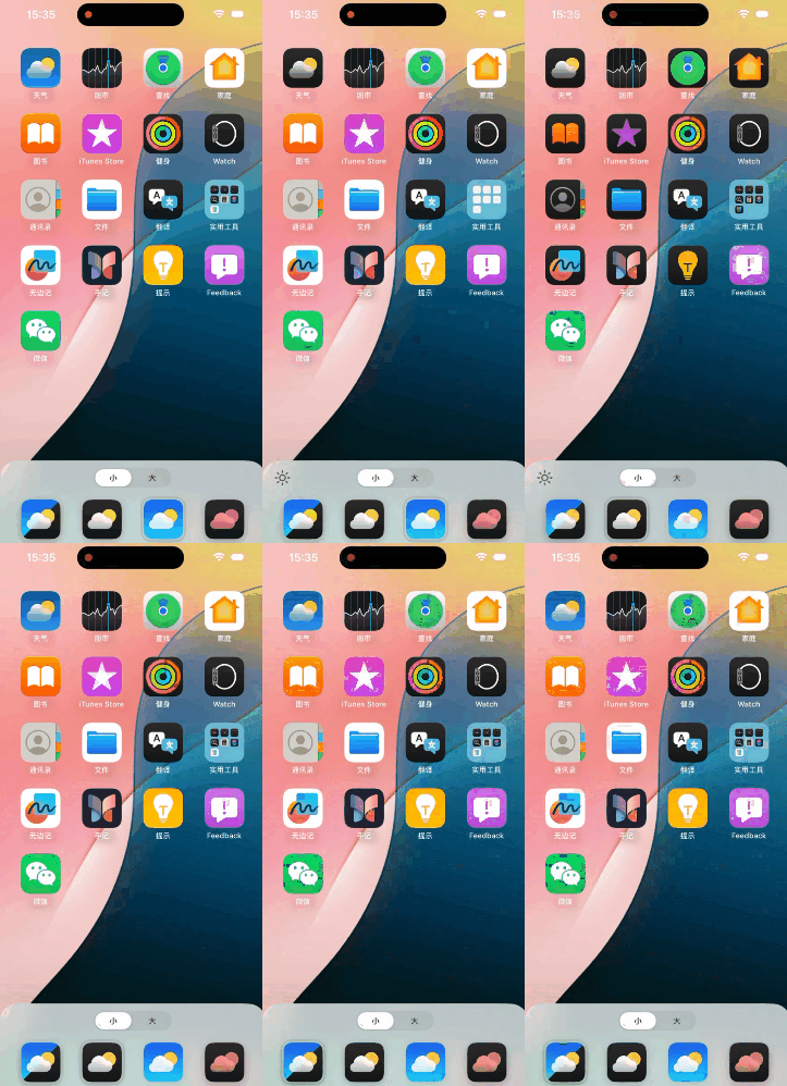
Image Source: Leitech
There's also a fourth option - coloring. Simply put, it's giving your icons a tint. However, unlike initially imagined tinting the background, as you drag the color bar, you'll notice that the entire background color of the icon changes. If you have a particular favorite color, then this feature is quite nice.
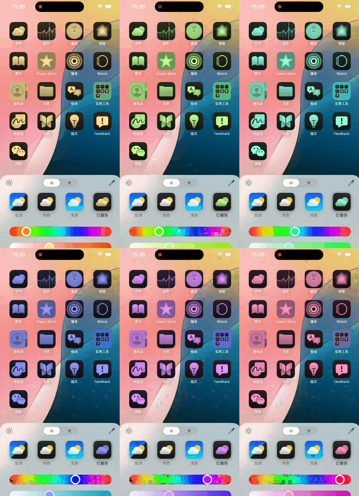
Image Source: Leitech
And now you can switch icons to a larger mode with one click. In the large icon state, the names of all icons will be hidden. This desktop design without any text will likely appeal to many people. Paired with custom icon coloring, it can give a sense of extreme simplicity.
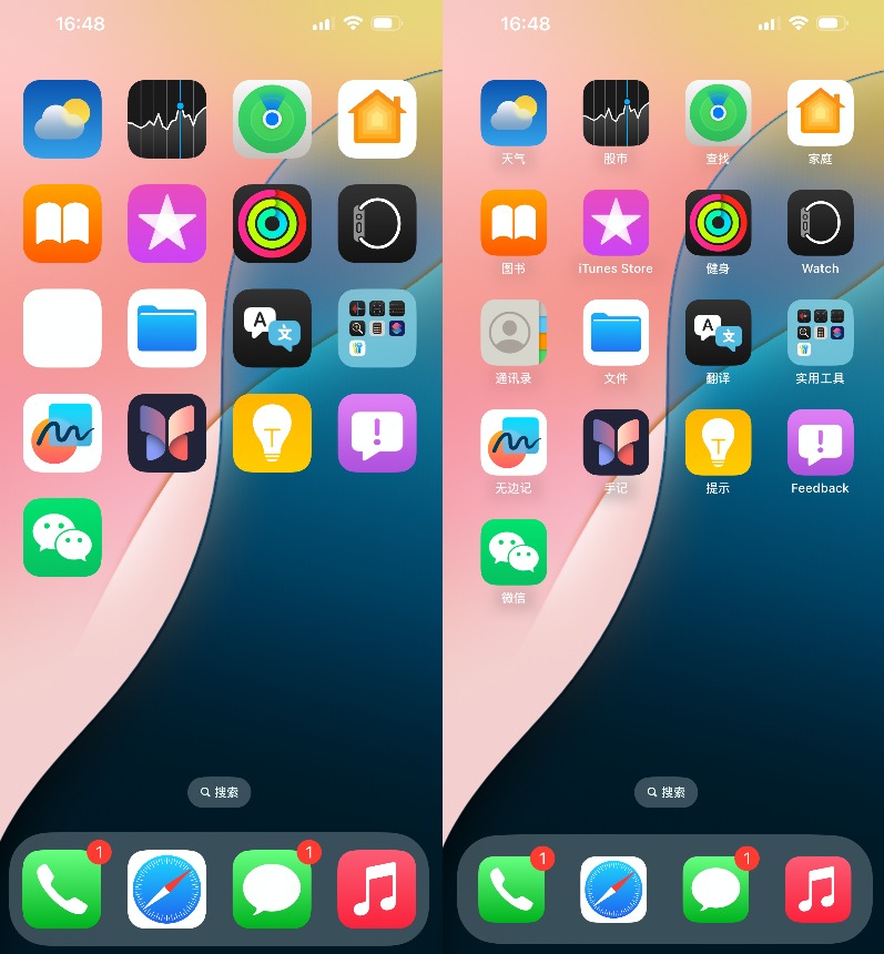
Image Source: Leitech
Apart from focusing on icon design, Apple has also optimized the addition and change settings of desktop widgets. In the enhanced menu that pops up after long-pressing an icon, you can see a new widget settings bar in addition to the original settings. Tap the corresponding widget to deploy it directly to the desktop.
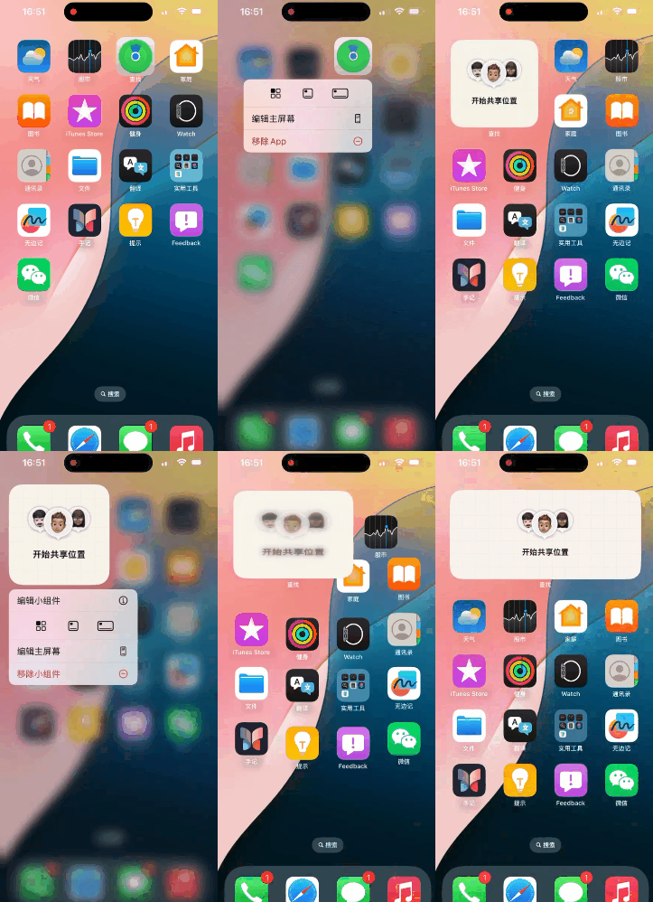
Image Source: Leitech
Isn't it convenient? However, note that widgets added using this method will directly replace the original app icon. If you want to add a widget separately, you still need to follow the previous process, long-pressing an empty area on the desktop and tapping the top left corner to add it.
The changes to the widget function have indeed made the experience more convenient than before, but this operation logic still leaves some遗憾. If a confirmation option for separate addition or icon deformation were provided when changing widgets, this issue could be easily resolved.
Although overall, there are still not many places where icons can be changed, it is indeed a significant improvement compared to the past. We can also see that Apple is striving to move towards personalization and customization rather than adhering to traditional design.
The Control Center Undergoes Significant Changes, Extremely Useful
The Control Center is undoubtedly the functional area with the most significant changes. It has transformed from a single-level menu to a multi-level menu and supports more custom settings. Under the default settings, the first-level pull-down page doesn't differ much from the previous settings page, but now you can long-press an empty area to enter the custom menu. The menu is subdivided into different components and quick buttons according to functions and apps, which can be freely added.
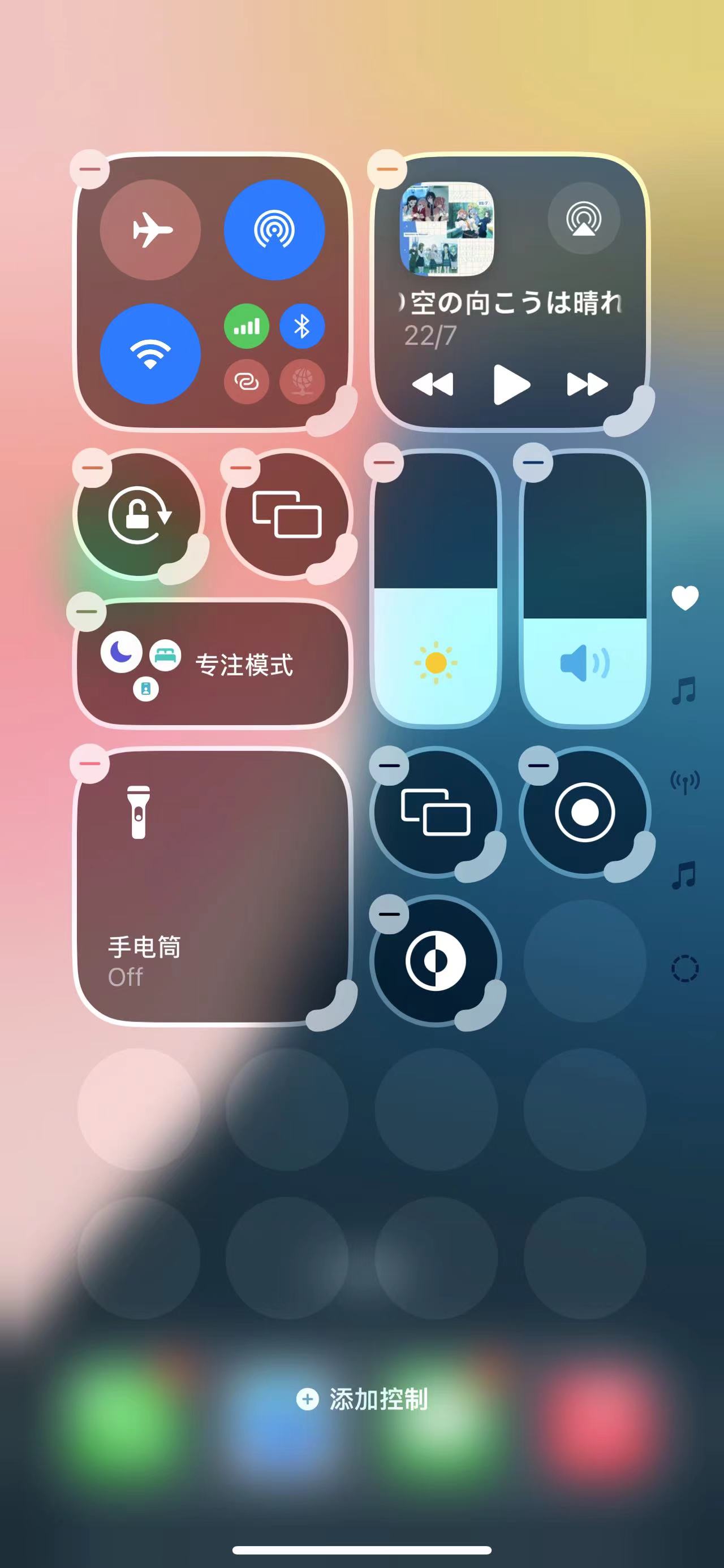
Image Source: Leitech
Additionally, sliding down in the Control Center will enter the media control module and wireless system control module. The former's functionality is self-explanatory, while the latter provides quick operation settings for a series of wireless systems such as Airplane Mode, AirDrop, and Bluetooth.
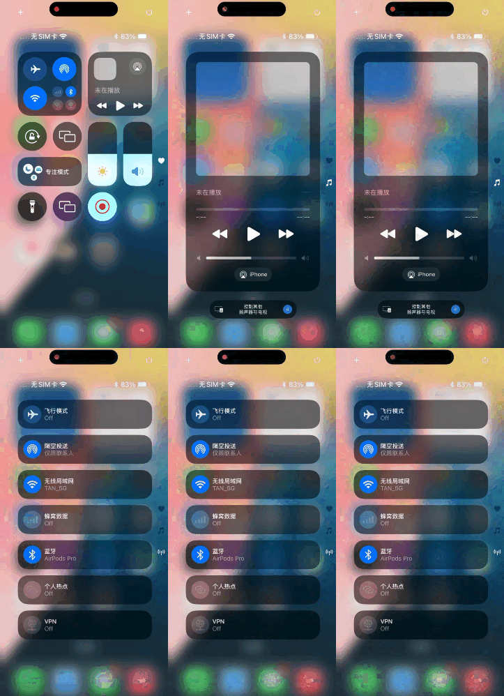
Image Source: Leitech
Interestingly, all of these modules support custom sizes. You can freely adjust the "footprint" of any icon, such as minimizing the media control center and filling the page with other quick buttons. If you feel there's not enough space, you can slide down to the fourth page. Keep sliding down in the editing page, and you'll see a blank page. When the space occupied by this blank page exceeds 50%, iOS 18 will automatically generate a new blank page.
Theoretically, you can stuff all App widgets and quick buttons into the Control Center. In addition to official apps, it will also be compatible with third-party apps, which is a great idea. After all, there should be quite a few people like me who want the convenience of widgets but don't want to see them on the desktop (some App widget designs are indeed questionable). They can stuff all these widgets into the secondary pages of the Control Center.
Moreover, by enlarging or缩小control options, you'll notice slight changes in the layout and functionality. For example, with media control, when minimized, it only supports pause, previous, next, and AirPlay. When maximized, additional options like favorites and volume control are added, and you can directly control smart speakers and Apple TV in Apple's smart ecosystem.
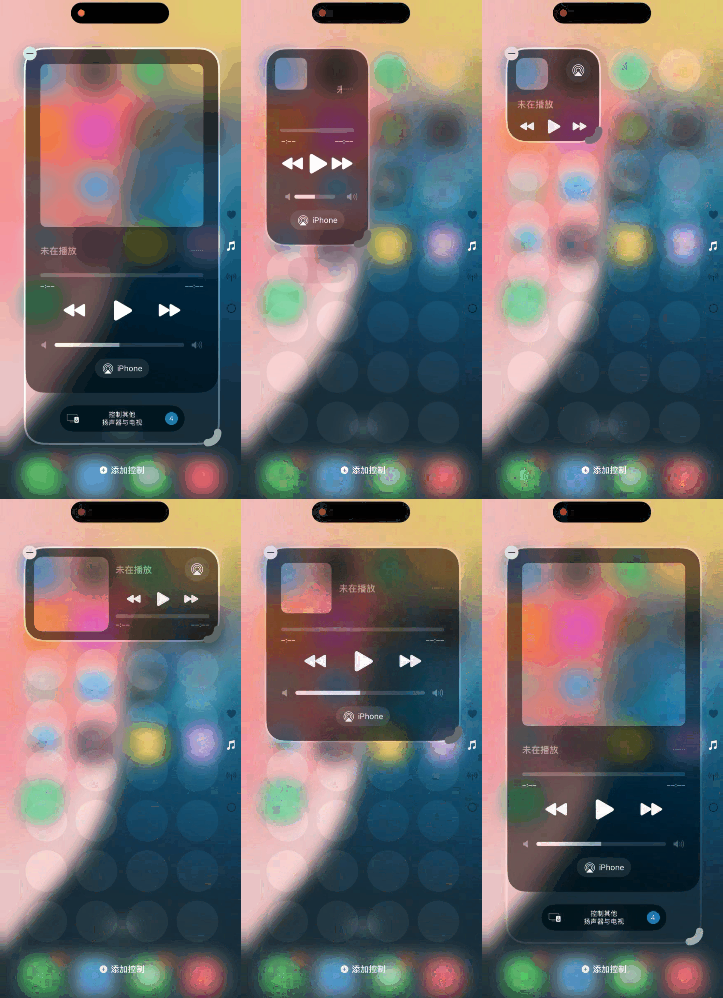
Image Source: Leitech
I must say that the changes to the Control Center are the most satisfying so far. Its playability and freedom are much higher than before, even surpassing several domestic customized systems known for their high freedom. For those who like to control everything directly from one page, this new Control Center will surely capture your heart quickly.
App Lock Experience is Maxed Out, "Photos" Undergoes a Major Makeover
In this update, although many official apps have received numerous updates, the ones with the most significant experience changes, in my opinion, are: App Lock, Photos, and Passwords. Among them, App Lock is a new feature, while Photos and Passwords have undergone significant revisions based on their original versions.
Let's start with App Lock. This feature is also available on Android, but it generally requires you to enter the settings page, open options like privacy and security, and find the app you want to lock among a row of apps. The operation is quite cumbersome. However, iOS 18's App Lock is very intuitive. Long-pressing the app icon will show the "Require Face ID" option. After clicking, two options will pop up.
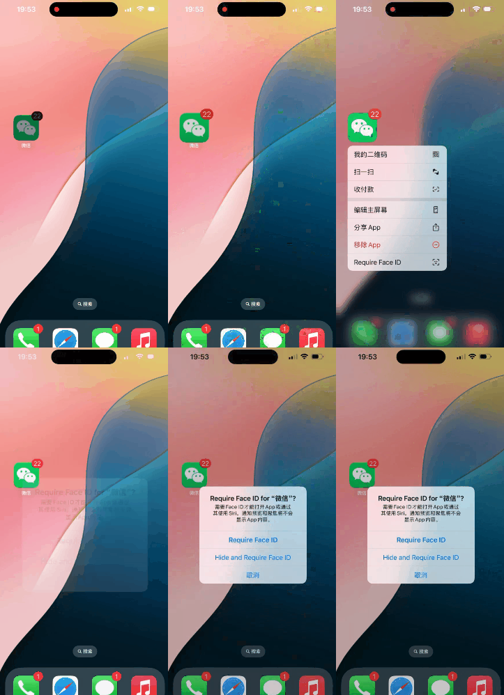
Image Source: Leitech
Choosing "Require Face ID" will directly lock the app. After clicking "Hide and Require Face ID," the app will be locked and hidden. At this point, even searching for the app's name in the search bar will not provide any feedback. To open a hidden app, you can only enter through the hidden folder in the App Library, and Apple has set up double verification. Before passing the Face ID authentication, you won't even see the thumbnail of the hidden app.
Locked apps must be opened using Face ID and do not support password unlocking, indeed maximizing the privacy of apps.
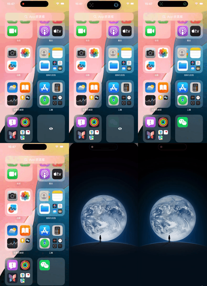
Image Source: Leitech
That said, I have also discovered some issues with App Lock. Apple engineers seem to have used a very clever way to hide apps. Simply put, the hidden app is not removed from the desktop but merely has its icon hidden.
The process of discovering this issue was also quite abstract. After long-pressing the desktop to enter the settings, I accidentally tapped the location where the WeChat app was before it was hidden. At this point, the iPhone popped up a window asking if I wanted to remove WeChat, but there was no WeChat on the desktop.
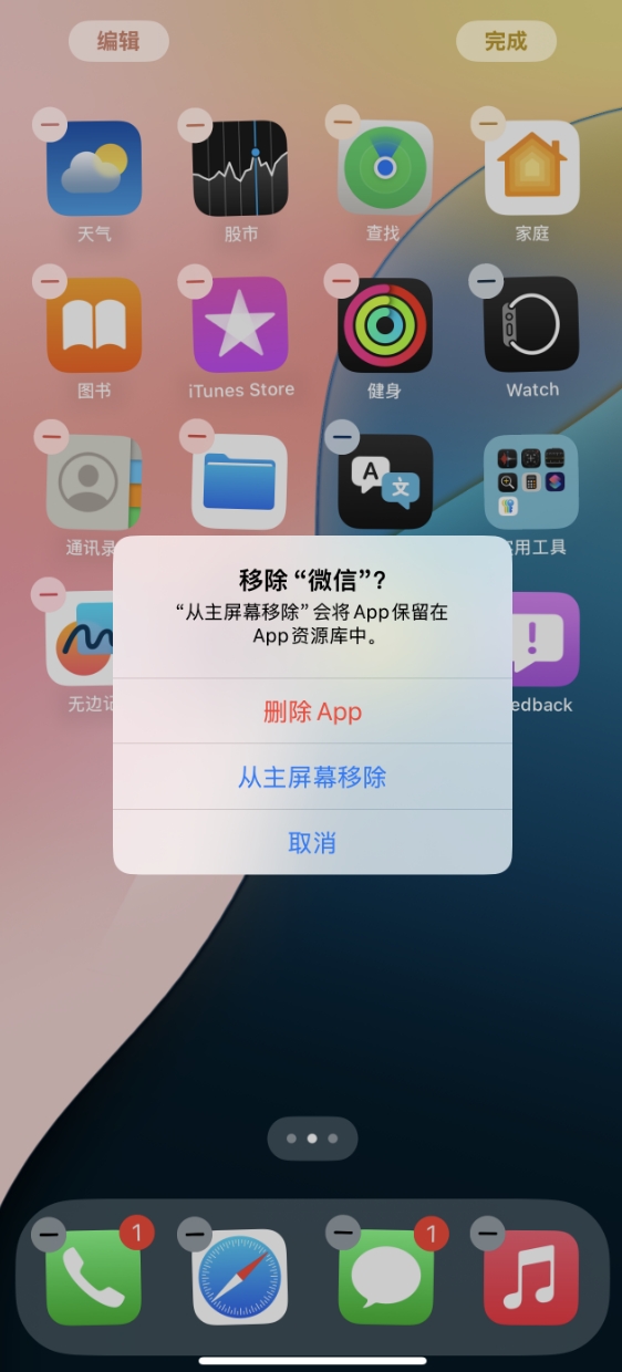
Image Source: Leitech
After several attempts, I even successfully summoned the app's advanced menu directly from the desktop while the app was hidden. Was it hidden? Yes, it was hidden. I'm curious if the engineers were rushing to get off work and used the simplest and most direct solution.
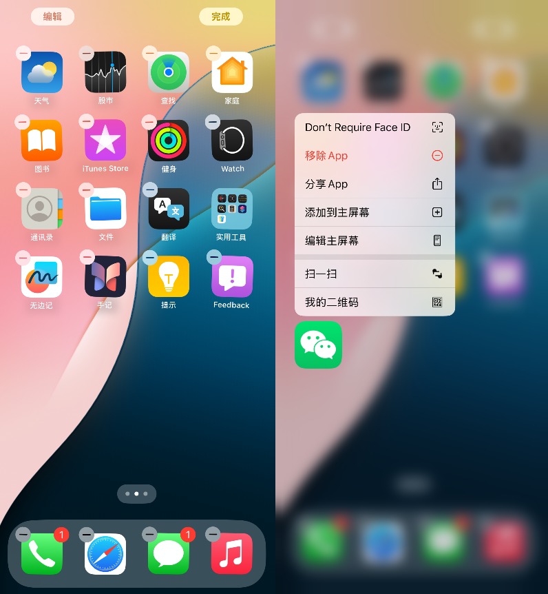
Image Source: Leitech
Let's take a look at the Photos app. Here's a comparison with the iOS 17 Photos app. You can intuitively see that the UI has undergone significant changes. iOS 17's Photos are divided into four options at the bottom, while iOS 18's Photos don't have this. All groups are incorporated into one page, which can be viewed entirely by sliding down, and sliding up shows all photos, making the operation more intuitive.
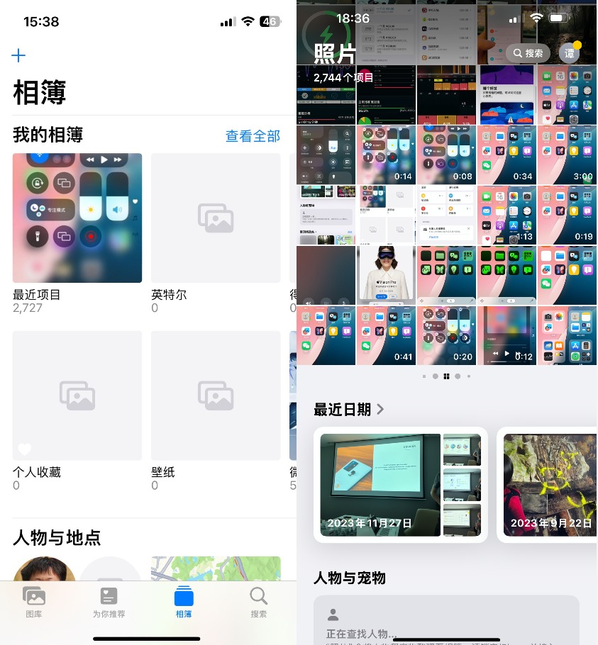
Image Source: Leitech (Note: Left is iOS 17, right is iOS 18)
Scrolling to the bottom reveals that iOS 18's Photos provides custom options. You can increase or decrease the groups displayed on the home page based on your needs. Some groups you don't want others to browse freely can disappear directly from the home page, and you can also change the order of groups by dragging and dropping, placing frequently used photo groups in more prominent positions.
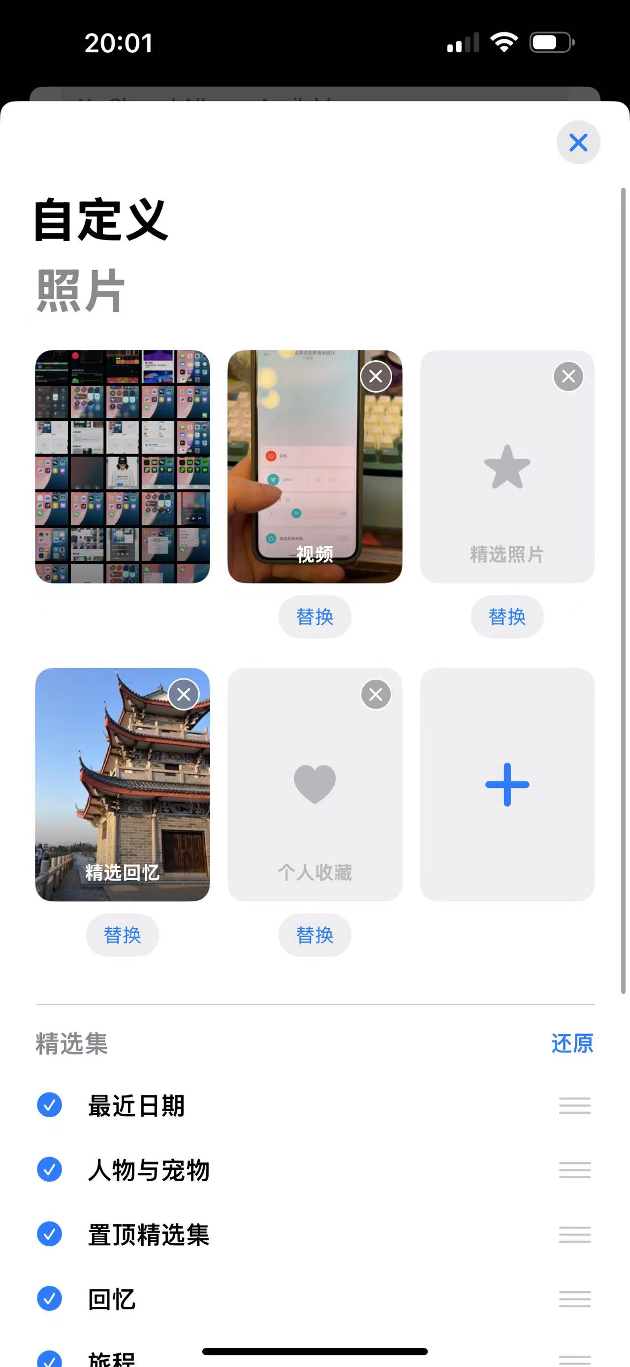
Image Source: Leitech
Additionally, iOS 18 has redesigned groups like media types, which can be viewed by swiping left and right. Compared to iOS 17's "retro" list design, it fits more with the overall style of the new iOS, avoiding the违和感of having different versions of UI designs pieced together.
Finally, let's take a look at the brand-new Passwords app, which is a new official app that has been separated from the original settings options. It requires Face ID verification by default to open.
Comparing it to iOS 17, you can see that the UI has been completely redesigned. The app divides passwords into multiple groups like passkeys, verification codes, and Wi-Fi networks, and separately groups passwords with security risks for easy viewing and management.
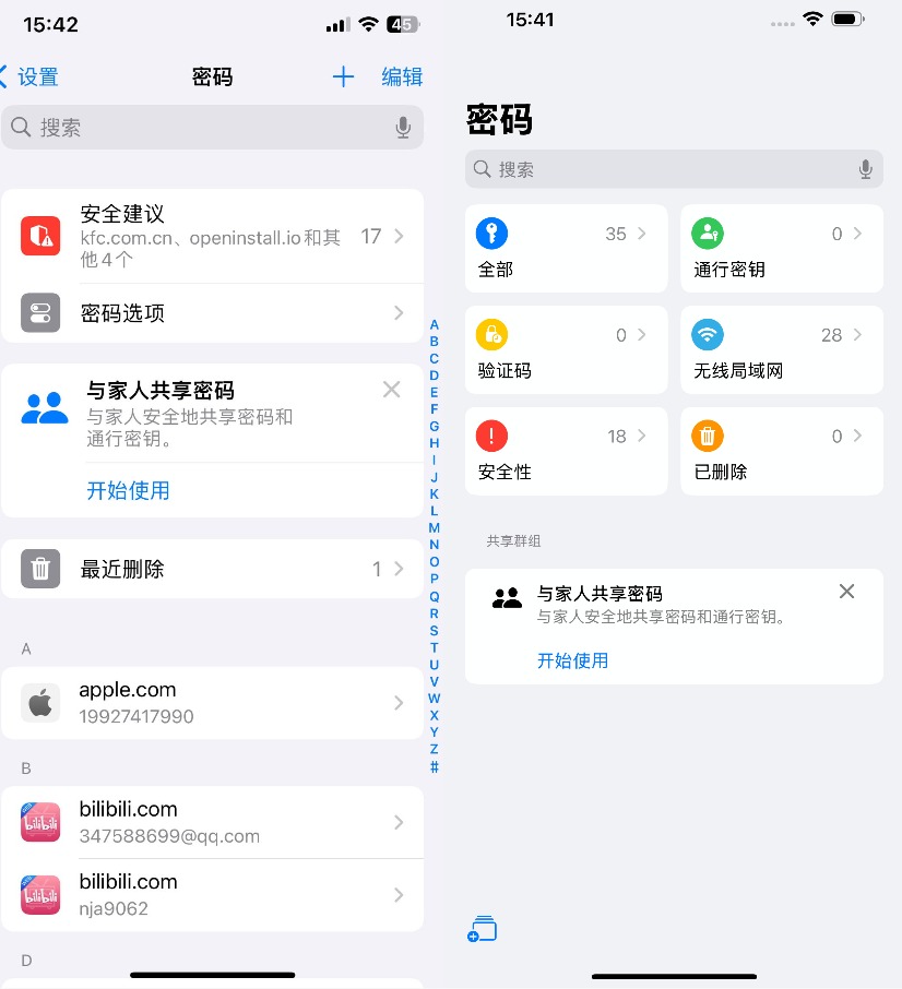
Image Source: Leitech (Note: Left is iOS 17, right is iOS 18)
Apart from these three significantly changed apps, many other official apps have also undergone targeted optimizations and changes, such as the Mail app that can automatically group emails based on content (not yet available) and the Maps app that can add personal notes to locations. The main direction is to make apps more intelligent and personalized.
iOS 18 Becomes More Aggressive than Android
When iOS 18 was released, many people felt that the system was becoming increasingly similar to Android. Although I had the same thought before experiencing it, after the actual experience, at least iOS 18 feels very different from the Android system to me.
Taking the Control Center's customization as an example, although this feature has been supported by Android for a long time, it is far inferior to iOS 18 in terms of freedom and functionality. You can even see some ingenious ideas from Apple's engineers. Moreover, it surprised me that the Control Center did not exclude third-party apps. Once upon a time, Apple wasn't too keen on allowing third-party apps to meddle with some system-level functions, but now it supports them from the start, which is indeed surprising.
Apart from the Control Center, the App Lock experience is also surprising. This intuitive and simple setting process completely outperforms Android's, even though Apple introduced this feature several years later than Android. But at least it's here now, and it works well.
Alright, that's the end of the praise. iOS 18 can indeed be called the most significant version in recent years, but in my opinion, Apple still has many issues to address, such as the side-swipe return issue that has persisted since the early days. The logic of returning to the left is still messy, and features like app dual-running and small windows are still absent. It can only be said that iOS still has many areas for improvement, but iOS 18 is indeed becoming more user-friendly.
As for whether iOS is becoming more like Android, I actually think this topic doesn't have much discussion value. Whether it's copying a cat to draw a tiger or vice versa, the user's only concern is: Is it usable? If it's usable, then that's it.
Cover Image Source: macrumors
Source: Leitech


