How Can AI-Generated Interfaces Escape the "AI Feel"?
 11/05 2026
 446
Series: "Writing High-Quality Code with AI: AI Werewolf Development Record." This article covers versions v1.6 → v1.12.3 | Time: Evening of 2026-10-22 – 10-23
Preface
After Part 5, the AI finally felt like six different people. I sent the link to a friend and asked him to give it a try.
He played for five minutes and replied: "This interface looks like it was generated by AI, doesn't it?"
That stung more than any bug: it wasn't "something is broken," but "the whole thing just feels off"—and that's the kind of problem AI itself can never catch.
Intro: Three Symptoms of the "AI Feel"
I stared at my page for half an hour and broke the "AI feel" down into three concrete symptoms:
1. Screens full of gradients + large rounded corners + glowing shadows. Every card is glowing, so there's no focal point.
2. All elements carry the same "importance." Titles, body text, buttons, and explanatory text have almost the same visual weight—because AI tends to "distribute evenly" when generating.
3. Details don't hold up to scrutiny. I enlarged the moon in the night scene to 3x—it was just a uniform off-white disc with a harsh outline around the edge.
The third one is the most telling: it's "correct," but it doesn't look real.
The Problem: Why Interfaces Made by AI Are Always "Just a Bit Off"
It's not that the model has bad taste; it's that it never performs the act of "judging."
Its goal is to "generate an interface that matches the description," not to "make a good-looking interface." So it reaches for the most common component forms (large rounded-corner cards + gradient buttons), makes every element "complete" (everything gets borders and shadows), and piles on more gradients when you say "make it more refined"—because in its training corpus, "refined" roughly equals "more effects."
That's why "asking AI to tweak it again" often makes things worse.
The real way to break the deadlock: take aesthetic decisions out of the code and settle them at the design level first. Changing one image is far cheaper than changing a hundred lines of CSS.
Cause of the Problem: Three "Design" Paths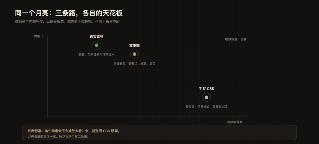
Figure: The horizontal axis is controllability, and the vertical axis is quality. Text-to-image sits in the upper middle; the ideal position is empty, so you can only pick a path based on your needs.
There is only one criterion: Will this element be viewed enlarged? If yes, don't force-draw it with CSS. The moon takes up a quarter of the screen width, so I took the middle path.
Solution: Three Steps to Bring Aesthetics Back
Step 1: Define the aesthetics with prototype mockups first
This step is the turning point of the entire Part 6. I no longer let AI write pages directly; instead:
1. Create six-screen prototypes in Ardot (an online design tool that supports MCP integration): home, configuration, match, spectate, settlement, login;
2. Lock down three things in the prototype: color scheme (warm black + old brass), corner radius rules, and hierarchy relationships;
3. Then let AI "reproduce according to the mockup."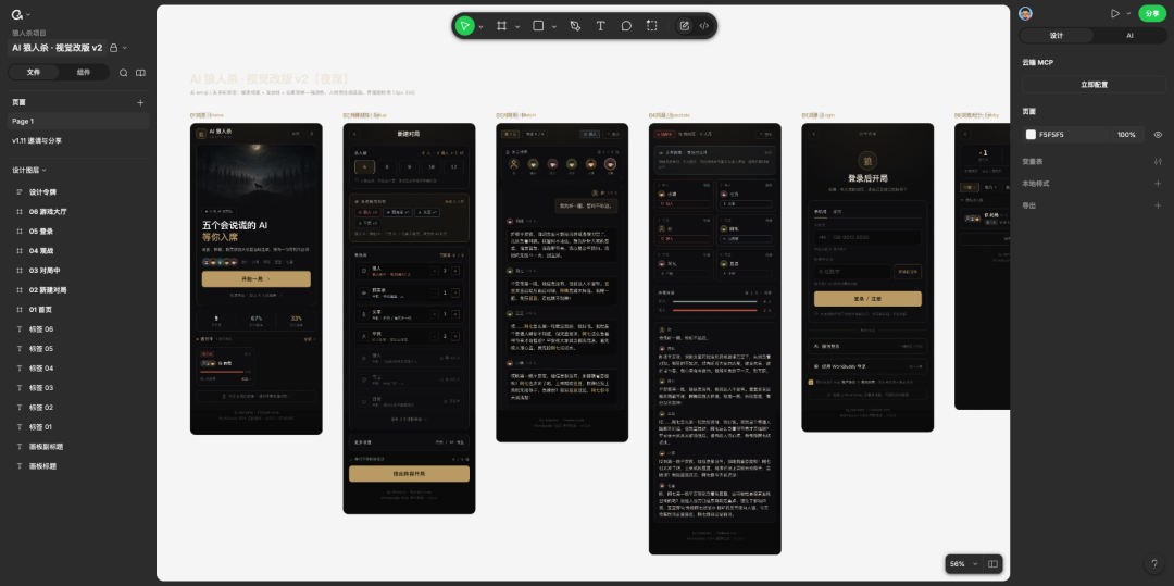
The most important output of the prototype stage is not the images, but the rules:
Only one accent color (brass). No second "bright" color is allowed anywhere on the site;
Cards have only two levels: main panel and secondary bar; no third level;
Shadows are only used to express "floating," not for decoration;
Text has three levels: primary copy, explanation, weak hint—font size and color change together, not relying on weight to distinguish them.
With these four rules in place, AI won't "freestyle" when writing CSS.
Step 2: Three iterations of the moon (main case study of this article)
Version 1: A CSS circle.
.nc-moon {
width: 88px; height: 88px; border-radius: 50%;
background: radial-gradient(circle at 38% 32%, #f4eee1, #d3cab8 58%, #8d8677);
box-shadow: 0 0 76px rgba(237,231,218,.12), inset -12px -10px 26px rgba(0,0,0,.42);
}
It looks "like a moon," but at 88px you can barely see a sphere—it looks more like a piece of off-white paper.
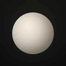
Figure: The moon in v1.9.0 (2x image): a uniform off-white disc.
Version 2: Four layers of CSS.
I started piling on details: sphere lighting, lunar mare dark patches, crater pits, feTurbulence noise. Technically very effortful, and the effect was indeed much better, but it still read as "drawn."
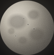
Figure: The four-layer CSS moon in v1.12.2: enlarged, it looks like "drawn texture."
The value of this step was confirming where the ceiling was. It wasn't "just tweak it a bit more," but "this path has reached its end."
Version 3: Switch to text-to-image.
The image generation used the platform's built-in capability, and the prompt went like this:
Realistic photographic style full moon close-up: the near side of the moon, the lunar surface almost fills the entire frame, the moon's edge just touches all four sides of the frame (no margins), clearly visible dark gray lunar maria and crater textures, warm ivory white and neutral gray tones (not bluish), natural light-dark boundary, slightly darker at the lower right, pure black background, centered composition, ultra-high-definition details, no text, no watermark, no border.
Analysis: Four constraints in this prompt are mandatory; miss one and you have to redo it:
"Fill the frame / edge touches all four sides" → otherwise it's a small moon floating on a black background and unusable;
"Warm ivory white + neutral gray, not bluish" → generated images default to cool tones, which conflict with the warm night color scheme;
"Slightly darker at the lower right" → give a bit of light-dark boundary to avoid becoming a flat sticker;
"Pure black background" → convenient for cropping into a circle with border-radius without leaving stray edges.
After generation, it still needs cropping—this is a step many people miss. The original image is a 1024 square, and the moon does not touch the edges. I measured the moon disc's bounding box and cropped by the box:
# Measure the moon disc bounding box, then crop centered to 950×950 so the disc exactly touches the four sides of the element
sips -c 950 950 --cropOffset 22 50 moon.png --out moon-crop.png
# Scale down to 512 (enough for a 96px element at 3x screen)
sips -z 512 512 moon-crop.png --out moon-512.png
# Convert to JPEG q78, final 76KB
sips -s format jpeg -s formatOptions 78 moon-512.png --out client/public/art/moon.jpg
macOS has sips built in, so nothing needs to be installed; on Linux, just switch to ImageMagick.
Analysis: The three commands correspond to cropping (removing margins), scaling (controlling size), and transcoding (controlling format). The original image was over 1MB, and after processing it was 76KB—the bandwidth saved is more than from optimizing JS for ages.
There is also a detail: the generated image has an "AI generated" watermark in the lower right corner. It falls in the black corner outside the disc and is cropped away by border-radius: 50%, so it doesn't show in the final image.
The last step is color grading. The generated image is cool and grayish, which doesn't match the site's warm black:
.nc-moon {
filter: sepia(0.14) saturate(0.92) brightness(1.08) contrast(1.02);
}
These parameters were tuned by comparing screenshots—when the first version had no filter, the moon clearly looked bluish in the night scene.
Step 3: Fix a 7-pixel line wrap
Let me also mention an overlooked detail issue; it's on the same page as the moon.
At the top of the match page there's a row of statuses: Day 1 · Voting, Alive 6/6, My Identity, Spectate, Exit. One day I found they were all compressed into two lines—not "too crowded," but short by 7 pixels.
I measured it: the five chips' content width was 365px, and the container was 358px. It was short by exactly those 7px, and the chips didn't have white-space: nowrap, so the browser used line wrapping to absorb it.
The fix is not "delete text," but two steps:
.ig-badge { white-space: nowrap; flex: none; padding: 0 6px; }
.ig-status { overflow-x: auto; scrollbar-width: none; } /*Fallback for extremely narrow screens: prefer horizontal scroll over line wrapping*/
Lesson: For this kind of "only a few pixels short" problem, measure scrollWidth and clientWidth first, then change styles—it's ten times faster than trial and error by eye.
Result: It holds up even at 3x magnification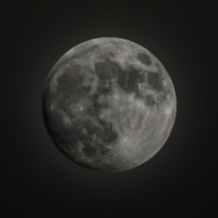
Figure: The processed moon, enlarged in the page; no residual black corners at the edges.
Three verifiable results:
The moon changed from "a white circle" to a real lunar surface, and the 96px element is not blurry even at 3x screen; the asset is only 76KB, saving far more than optimizing JS for ages;
The visual baseline was set: one accent color, two card levels, three text levels. Every screen added afterward was reproduced according to the mockup, and consistency became the default for the first time;
The three symptoms of the "AI feel" disappeared one by one: no more full-screen gradients, visual weight gained hierarchy, and details held up to magnification.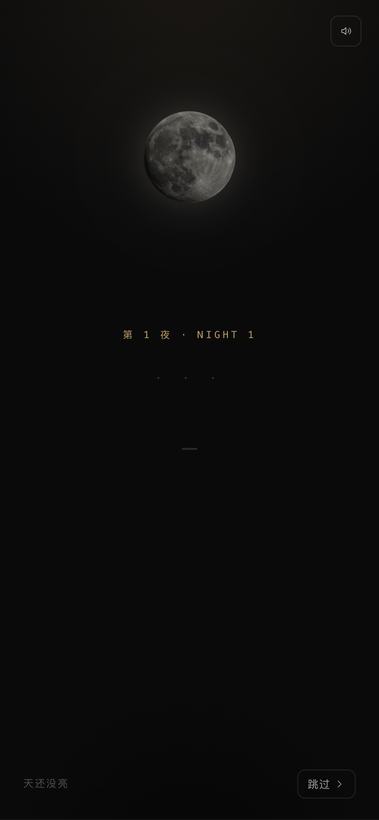
Figure: The full night screen. Passwords fall line by line, and the moon is a real image—for the first time this screen's "atmosphere" feels like a work.
This approach is only used for elements that "will be viewed enlarged"; otherwise both size and labor cost will spiral out of control.
Summary
1. The three concrete sources of the "AI feel": indiscriminate gradients, evenly distributed visual weight, and details that don't hold up to magnification.
2. "Tweak it again" often makes it worse, because the model's "refined" roughly equals "more effects." The way to break the deadlock is to step back from the code layer to the design layer.
3. The real value of prototypes is producing rules (how many accent colors, how many card levels, how many text levels), not producing pretty images.
4. The criterion for deciding whether to switch technical approaches: Will this element be viewed enlarged?
5. Image generation is only the first step; cropping/scaling/color grading are what make it usable. Prompts given to AI must clearly state hard constraints like "fill the frame" and "not bluish."
6. Is it transferable? It applies to any "AI-generated interface" project: define rules first, then execute; judge the ceiling first, then switch methods.
-
![]()
October 2026 EV Startup Sales Roundup: Silver October Surge! These Three Automakers All Hit New Highs
-
![]()
Tmall's Token Sales Go Viral During Double 11: How Far Is AI From Becoming Like "Utilities"?
-
![]()
How Can AI-Generated Interfaces Escape the "AI Feel"?
-
![]()
Like-new phones become hot commodities, why are second-hand phones so popular?
-
![]()
"I Bought an Extended-Range Car — No Regrets Six Months Ago, But Now I Do"
-
![]()
Can Tmall Turn Tokens into a Mass Consumer Product on Double 11?
-
![]()
What Is the Real Reason for Buying a New Energy Vehicle?
-
![]()
When India Takes Over Iveco, a New Roadblock Emerges for Chinese Commercial Vehicles Going Global